Create the perfect cover photo for Facebook’s new Timeline layout

Regardless of whether you like it or not, everybody will eventually have the new Timeline layout for their Facebook profile or page. I personally like it. I think the layout is cleaner, and provides more flexibility when it comes to customization.

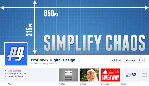
A major part of the new layout is the Cover photo, which is the large image that encompasses the top 315 pixels of your profile/page (excluding the Facebook bar across the top). Choosing what to place here is much more than choosing a photo from your existing albums, or uploading a plain photo. The key is developing an image that better explains yourself or your business.

Choosing what to design can vary widely, but should be focused on what you want to emphasize or portray about yourself or business. For a Business Page, you might want to include a series of photos that relate to the products or services that you offer. Here at ProGravix, we chose to use an image that mimics the look and feel of our website, which currently emphasizes our mantra, Simplify Chaos.

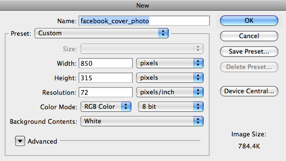
To get started, fire up your favorite graphics application. We chose Photoshop CS5. Create a new document with a size of 850x315px.

What you do next is up to you. Be creative! Can’t? Well, that’s where we can help. If you need assistance in developing a cover photo, please contact us. You’ll be glad you did.

When designing, make sure not to place any important content, such as text, where the profile photo is, which is on the bottom left of the cover photo. Any content placed here in the cover photo will be covered up by the logo.

Whatever you design, make a statement with your cover photo. Just because it’s a static image doesn’t mean it should be plain. As always, keep it simple and clean!

This has been today’s Clarified Butter.

Create a custom Facebook Business Page Tab for the new Timeline layout

Facebook recently announced that Facebook Pages for Businesses will be receiving the same new Timeline layout that personal accounts have had for some time now. I know, I know, most of you are getting sick and tired of the constant changes over at Facebook, but I think this new layout is awesome.

Over the past couple of days, I’ve been trying to figure out how to add a custom Page Tab in this new layout. Page Tabs are those rectangular thumbs below your cover photo (which include a tab for Photos and Likes by default). Any apps you have installed would also be presented here.
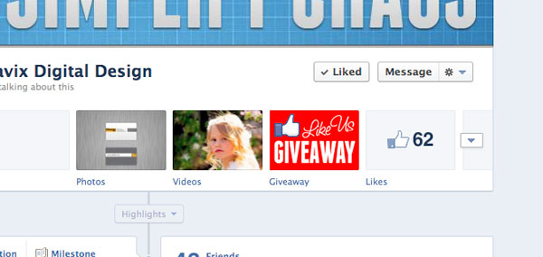
I could easily create the Page (the actual page that shows the content), but getting the actual Tab to show up on my Facebook Business Page wasn’t so easy…

In this post, we’ll be discussing how to create a Page Tab to display custom content inside of Facebook. In other words, create a website page within Facebook that is associated with your Business Page. This is useful if you want to post a coupon, promotion, or other content that doesn’t fit elsewhere on your Facebook Business Page.

The Page Content
Before you do anything, you need to create the actual content to display within the Facebook page. I won’t go into specifics with this, since this is outside the scope of Facebook (and this post). In general, you need to create an HTML page, using any technology you prefer, such as HTML, CSS, PHP, JS, etc. My only suggestion is keeping the content no wider than 790px. It’s also best not to have the content very tall. If you do, those ugly iFrame scroll bars will likely appear. Once you have your content developed, it needs to be available online. If you need help developing the content, and/or adding it to Facebook, please contact us.

For the purpose of this tutorial, let’s assume your content is created and available at http://www.example.com/facebook/index.html.

The Facebook App
Don’t go running off now! Yes, we are going to create a Facebook App, but only for the purpose of creating the Page Tab. You don’t need to be a developer, or know anything beyond what you already have in your noggin. Go to https://developers.facebook.com/apps and click on Create New App.

Enter a name for your App. This isn’t really important, since you are going to be the only one that sees it. Also, namespace is not needed since we are just creating this app for a Page Tab. Click Continue, and complete the CAPTCHA security check.

On the Basic Settings page for your newly create app, no further information is needed under Basic Info, so click on the Page Tab selection at the bottom.

For Page Tab Name, enter the name you would like to appear below the button on your Facebook Page.

For Page Tab URL, enter the URL where the content exists on your server. Our example above was http://www.example.com/facebook/index.html.

For Secure Page Tab URL, enter the SSL URL where the same content exists on your server. This would be a URL that starts with https://. For example, https://www.example.com/facebook/index.html

You can leave Page Tab Edit URL blank, choose Wide (810px) for the Page Tab Width and click Save Changes.
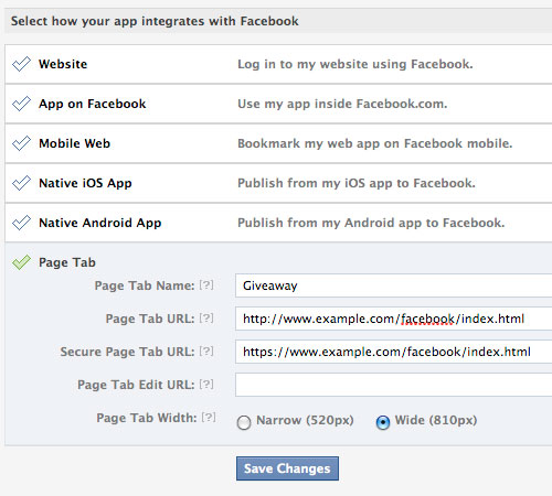
Now, the part that was nearly impossible to figure out. I’m not sure why Facebook doesn’t provide a way to install the app to your page from within the app’s settings page. Maybe this is a glitch that will be cleared up soon. While you are still on your app’s basic settings page, make a note of your App ID and Page Tab URL (which in our example is http://www.example.com/facebook/index.html). Open a new browser window and go to:

https://www.facebook.com/dialog/pagetab?app_id=ENTER_APP_ID&next=ENTER_PAGE_TAB_URL

Make sure to replace ENTER_APP_ID and ENTER_PAGE_TAB_URL with your variables. Hit enter, and then choose the page you wish to install your new App to.
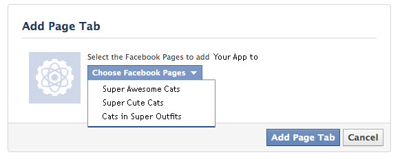
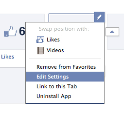
Now, go back to your Facebook Business Page. You will now see the new Page Tab button, and the name you chose below it. As of right now, it shows the default Facebook App icon. To change this, click on the triangle to the right of your page tabs, then hover over the new tab and click the pencil to pull up the options. Click Edit Settings. When the new window appears, click on Custom Tab Image and follow the steps.

Test your new Page by clicking on the Page Tab. The content you have posted to your server will now be displayed within Facebook.

This is a simple implementation of a Facebook Page Tab. Page Tabs can be enhanced to perform many advanced functions. The most popular is a like-gate, where you hide content, such as coupons or promo codes, from visitors until they Like your page. Hopefully a future blog post will cover this, but for the time being, I think getting this far using the new Timeline layout for Facebook Business Pages is a huge accomplishment.

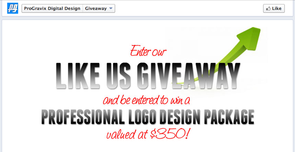
To see an example of a working like-gate experience, head on over to our current promotion on Facebook (promotion has expired). This is using the same method we just outlined, with the added like-gate code (wherein we hide the entry form from the visitor until they like our page). While you’re there, like us so you can be entered to win a Professional Logo Design Package, valued at over $350!
This has been today’s Clarified Butter.

Plain Black vs Rich Black

Black is black, right? I mean, as a child, you undoubtedly had a crayon labeled black. Obviously based on the size of your crayon set, you likely had many very weird color names, but there was only one black.

In graphic design, and more precisely print, there are many definitions of black. Generally, designers define in terms of CMYK, RGB, HEX, PMS, etc. When it comes to black, you really need to choose the right one based on what you are designing.

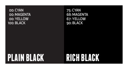
In general you can break black down into two categories, either pure, solid colors (such as Pantone or single inks) or percentages of several different colors to achieve black (such as CMYK). I call the pure, single color plain black, whereas the mix of colors is referred to as rich black.

What’s the difference?
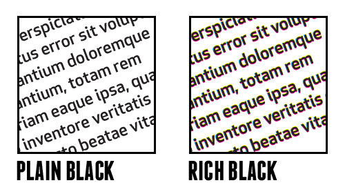
In applications such as Illustrator and InDesign, where most typesetting generally occurs, default black is defined as 100% Black. In Photoshop, default black is generally defined as Cyan: 76%, Magenta: 68%, Yellow: 67%, Black: 90%. Many times, this rich, Photoshop-defined black is desirable to achieve a very dark black appearance (especially in glossy offset printing). Plain black can appear more gray in print, and can ruin an entire design.

So, why not always use rich black? Well, say you designed a piece that contains large amount of text, and you choose to color that text using rich black. You are creating a nightmare for the printer, and a potential rerun at a loss. Having defined that text using four different colors requires that the printer overlay those colors precisely on top of each other to create the rich black, which is very difficult to do (especially on thin or small fonts).

It’s best to use a complimenting mix of plain and rich black in one piece. Keep text in plain black, and large graphic elements in rich black. Just be careful with your rich black mixtures. Don’t get it just right, and you end up with greens tints to your black. There is a general disagreement about what is the proper mixture of rich black, but if Photoshop defines it as 75/68/67/90, I’m happy to agree.

This has been today’s Clarified Butter.

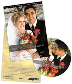
First impressions: the DVD packaging

I think we have a unique situation here at ProGravix. Seeing as how we are graphic designers and web developers, we have an advantage over other videographers that don’t share this same skill set. First, and foremost, we are graphic designers. This bleeds over into web development. But how can it help with videos we create? Tons. Certainly the actual capture, editing, and display of that video is a substantial part of the project. But I think making an impact with the packaging is extremely important. As graphic designers, we use our expertise to create engaging, studio quality DVD cases and faces that invite the viewer in, and give an impression that what they are about to watch is an important keepsake.
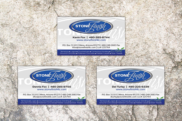
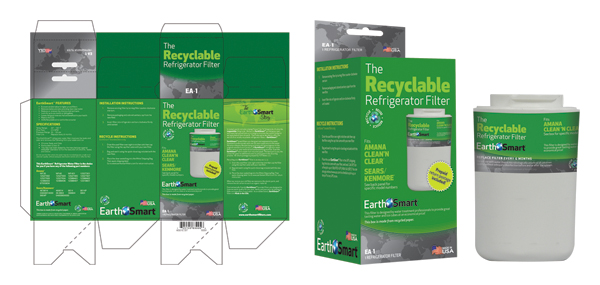
Providing a physical package that you can touch, feel, and see grabs the customer, and potential customer. It tells them that what they hold in their hands is a one-of-a-kind heirloom. A polished, personal project that can be presented in their home for anyone to see, without the need to watch.

I’ve seen other videographers write the name of the client or project on the face of the DVD with a marker, or drop it in a DVD sleeve along with a business card. I think it’s important to let your customer know that you were fully invested in their project. You used every ounce of creativity you had to create something that you are personally impressed with.

Aside from wedding videos, a lot of videos we create are gifts. It’s important that the gift be something impactful when presented or opened. You want the recipient to be excited about that gift, without the need to immediately watch it. You want the packaging to entice the receiver to want to watch it.

So, please videographers, put down the marker and make a presentation with your video and packaging. If you don’t know how, let us know, we’ll be happy to help out.

This has been today’s Clarified Butter.

Present proofs with impact

We provide 100% of our proofs digitally, over the web. It’s important that you create a proof that helps present all that encompasses your design. With all items, even those intended to be flat, such a business cards, it’s still important to go beyond the design of the piece, and present it in a real-world environment. What would that card look like on a client’s desk? How will that box present itself in a retail environment?

The majority of proofs we create are displayed online, via a custom proofing area for that specific project or client. This affords us the ability to use web development techniques to create a dynamic presentation.

When we develop a logo, usually creating four or five different concepts, we take our favorite and develop letterhead, envelope, and business cards. These pieces fully integrate the logo. In the end, they might not accept that logo, but it gives them the insight that other ideas can be just as, if not more, engaging.

We develop a lot of packaging material. Certainly flat proofs are sent so that they may review the actual printed content, but it’s also important to present that packaging in a real world example. This helps the client understand your design, explaining why you used the colors you did, or why you wrapped certain elements around the box. We’ve had clients question a design, but not until they saw the real world example did they really understand and accept the design.

It might be difficult or seem like an unnecessary step, but in the end, it will really help push the ideas that you create. As designers, it’s difficult for us to get the client to envision what we see. This is a simple way to accomplish that. And, if you haven’t noticed, we love simple.

This has been today’s Clarified Butter.

Spam, we hardly knew ye

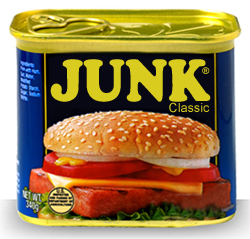
You’d think that having such a dominant online presence, I would be much more susceptible to spam. The truth is, I hardly ever see it. You’re probably sitting there wondering what the heck I am talking about. Everybody gets spam, right? We’re always clogged up with viruses, avoiding overseas scams, and constantly shuffling through our junk folder to find that one good email accidently flagged as naughty.
Not me.

First off, we use Macs here, running one flavor of Mac OS X or another. We’re insane about our backup techniques, and never download anything from the internet unless it’s from a reputable source. So, let’s throw the fear of viruses right out the window.

I came across this solution when I was trying to solve a problem with iOS not having a junk mail feature. I had never used the Junk Mail feature in Mac Mail, my preferred email client, and preferred to let everything accumulate in my inbox. This was fine at first, but when the spam really started to flow, I needed a solution. That solution couldn’t be based on Mac Mail’s junk mail feature, because I never wanted the spam to be downloaded in the first place. This meant that it had to be taken care of at the server level.

We use Google Apps for our email and other online needs, but for the purposes of this post, Gmail functions exactly the same way. We need to setup a filter within Gmail that stops the spam from ever getting sent to our inbox.

If you don’t have Gmail (or Google Apps) I highly suggest you get it, and forward all your mail there. It’s up 99.9% of the time, and dang easy to setup and use.

Let’s set this up.

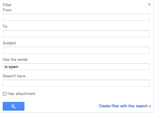
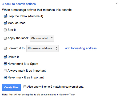
After you’ve logged into Gmail, go to Settings and click on the Filters tab. Click ‘Create a new filter.’ In the resulting window, enter “is:spam” (without the quotes) in the ‘Has the words’ field and click on ‘Create filter with this search.”

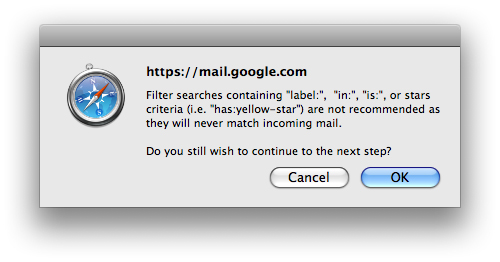
A dialog will pop up warning you that using “is:” will never match incoming mail, but I can assure you, it does. Click ‘OK’.

On the next window, check the following:

  • Skip the Inbox (Archive It)
  • Mark as read
  • Delete it
  • Never send it to Spam
  • Never mark it as important

This will put all mail that Google considers spam into the Trash folder. It will appear as already read (so you won’t have any unread flags). This is also good because Trash is automatically deleted in 30 days, so you never have to go in and manage your junk mail. It also gives you a 30 day window to find any messages inappropriately flagged as spam. I can tell you, however, that for me, not once has a legitimate message been flagged as spam by Google. All my junk goes directly to the trash and I never see it.

Now, just to get a similar setup with my local Letter Carrier. Maybe she can put it right in the recycle so I don’t have to touch it.

So, there you have it, a great solution for spam management that’s easy and effective.

This has been today’s Clarified Butter.

My current favorite fonts

I saw a blog post the other day written by a designer, and he shared a set of fonts that he’d been partial to lately. I figured I would make a similar list, but let’s call it my current favorites, because, to be quite honest, a font only lasts as long as your favorite shirt that turns into vaporwear. I have a list of eight fonts that I tend to use quiet a bit. They are shown here in their native form (with loose tracking). When I use them within projects, they are usually altered quite a bit.

Enjoy…

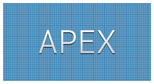
Apex. Here it’s shown as Apex Book, but it comes in flavors from Thin to Ultra. This is a great font for headers and other callout areas. I would say it’s not a good idea for body text or other areas where numbers might be used. The numbers within this font have a very mixed baseline, and are usually well below the baseline of their alphabetic companions.

Bebas. Another great font for headers since it does not include lower case. You can fiddle with it to create a good looking small caps, but really this font looks best native, with a very loose track. Here it’s shown with a tracking of 40.

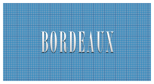
Borbeaux. Okay, so this font might not get a lot of use, but when you need something clean, crisp, and thin, this is your font. I recently used it across various spaghetti fundraiser materials, from tickets to posters and flyers.

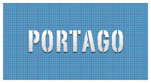
Portago. This is a great font for travel-based media. This is another font with only small caps, no lower case, so it’s use is limited to headers and callouts.

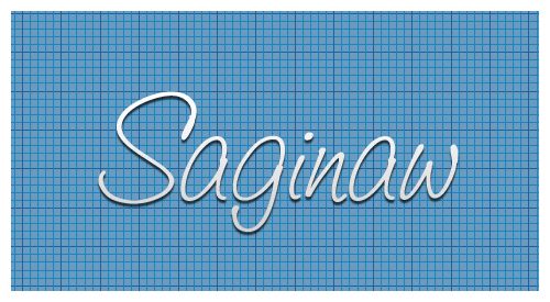
Saginaw. It’s rare to find a script font that reads well. Shown here in Medium, it’s also available in Light and Bold. Other than using it for mock-signatures, I really like it for designs that call for a wispy or light feel. It’s great for logos that need a similar feel.

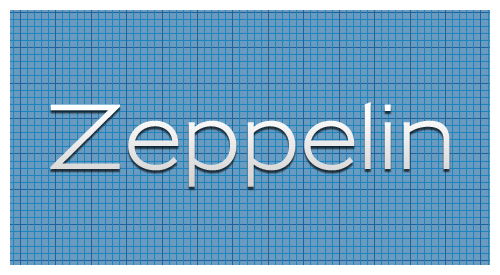
Zeppelin. This is a very versatile font. Shown here in 41, it’s available in widths and weights from 31 to 53. I love using this for small, uncluttered tables (such as specifications) where Helvetica or Arial would usually prevail.

Franchise. My current favorite of favorites. This is currently being used throughout progravix.com, and it looks great. Another font with only small caps (no lower case), but that’s fine with me. It looks great big and bold. I love using this on construction material, or huge display areas that demand your attention.

Trajan. I must really like fonts with all caps, or small caps, because here is yet another. This is a serif font, that really doesn’t have overbearing feet. This is perfect for announcements, or a very corporate look and feel. It’s an attorney’s perfect font, since any name looks great in it.

So there you have it, eight of my current favorite fonts. Out of the 1,238 fonts I have installed on my system, I think I did a good job whittling it down to eight. Makes me really think about recycling some of those unused fonts.

This has been today’s Clarified Butter.

Keep it vector, Victor

Vector graphics is the use of geometrical primitives such as points, lines, curves, and shapes or polygon(s), which are all based on mathematical expressions, to represent images in computer graphics. “Vector”, in this context, implies more than a straight line.

You know, I really love Wikipedia.

I try my best to keep illustrations vector, and with the seam-busting amount of tools in Illustrator, it’s a fairly easy task. I will agree, however, that raster images do have their place. But, when it comes to developing content that needs to be scalable, without the loss of quality, vector is where it’s at.

I probably spend 80% of my time in Illustrator, designing logos, box artwork, labels, trade show booths, and thousands of other items. If at all possible I can replicate a raster-technique using Illustrator, I do it.

Recently, I was asked to create a logo where an element of the design had an iridescent finish. Iridescent is that rainbow reflection you get from stones and other materials. Most of us probably see it when crude oil and water are mixed. When the sun’s light reflects off the surface of the oil, the light radiates a rainbow shine that moves when the oil moves (or we move).

Now, accomplishing this in vector format might seem impossible, and given that this is a static image, how could we truly portray an iridescent appearance? It’s not important that the element look exactly like a real world example, rather that it portray itself as such. Thinking outside the box, or inside Illustrator, is where we need to focus. I chose to use varying shades of the iridescent colors to create boxes of increasing size on an arch, or more clearly, in a half-circle, where the boxes become increasingly larger the further they get from the bottom center. What we are left with is not a mixed gradient of the colors, rather a unique image that presents a multi-surface appearance.

So, in the end, we are left with a purely vector image that can be scaled to several thousand feet in width, if needed, with no loss of quality.

This has been today’s Clarified Butter.

Simplicity, a core value

Steve Jobs once said that one of the greatest ad campaigns, “Got milk?,” isn’t even about the product. It’s about the absence of the product. Now, think about that…

It’s true that some of the world’s best known brands are much less about themselves, and more about others who portray what the brand’s core value is. Marketing experts envision an entire ecosystem for the brand, from packaging and distribution, to dynamic retail displays. To me, establishing a new brand or corporate identity starts with a logo.

Now, you may think that a logo must represent a company’s products or service. This is not necessarily the case. In keeping with our simplicity ideology, less is more. Much more. It’s not a requirement that the logo actually include an illustration in-keeping with the brand’s genre. It’s much more important to design a logo that will be rememberable. For example, think about Nike, Target, or Tide. Their logos are clean, crisp, and very much rememberable. We know that the swoosh is Nike. Nike, and a slew of well paid marketing experts, made sure of that.

So how can we achieve this for your new brand? Invoke simplicity. Don’t overdo it. Many designers will, and those are the brands that will fail. If a logo is busy, cluttered and overbearing, the potential customer will feel the business shares these same attributes, and will look elsewhere.

So, if you are in the market for a logo or a identity refresh, let us help. It certainly can’t hurt, especially since we offer a 100% money-back guarantee.

This has been today’s Clarified Butter.

One more thing…

Just over a month ago I wrote a post regarding Steve Job’s resignation as CEO from Apple. I expressed my fear that Steve’s days were limited. I never would have thought it would come so quickly. I can’t remember the last time I’ve been so saddened by the passing of someone I never met.

He was truly a revolutionary genius. I thank you Steve for what you have given. Not only to the Apple community, but to the entire world. Your extraordinary vision and leadership has proven to be a quality that many will fail to exceed.