Present proofs with impact

We provide 100% of our proofs digitally, over the web. It’s important that you create a proof that helps present all that encompasses your design. With all items, even those intended to be flat, such a business cards, it’s still important to go beyond the design of the piece, and present it in a real-world environment. What would that card look like on a client’s desk? How will that box present itself in a retail environment?

The majority of proofs we create are displayed online, via a custom proofing area for that specific project or client. This affords us the ability to use web development techniques to create a dynamic presentation.

When we develop a logo, usually creating four or five different concepts, we take our favorite and develop letterhead, envelope, and business cards. These pieces fully integrate the logo. In the end, they might not accept that logo, but it gives them the insight that other ideas can be just as, if not more, engaging.

We develop a lot of packaging material. Certainly flat proofs are sent so that they may review the actual printed content, but it’s also important to present that packaging in a real world example. This helps the client understand your design, explaining why you used the colors you did, or why you wrapped certain elements around the box. We’ve had clients question a design, but not until they saw the real world example did they really understand and accept the design.

It might be difficult or seem like an unnecessary step, but in the end, it will really help push the ideas that you create. As designers, it’s difficult for us to get the client to envision what we see. This is a simple way to accomplish that. And, if you haven’t noticed, we love simple.

This has been today’s Clarified Butter.

My current favorite fonts

I saw a blog post the other day written by a designer, and he shared a set of fonts that he’d been partial to lately. I figured I would make a similar list, but let’s call it my current favorites, because, to be quite honest, a font only lasts as long as your favorite shirt that turns into vaporwear. I have a list of eight fonts that I tend to use quiet a bit. They are shown here in their native form (with loose tracking). When I use them within projects, they are usually altered quite a bit.

Enjoy…

Apex. Here it’s shown as Apex Book, but it comes in flavors from Thin to Ultra. This is a great font for headers and other callout areas. I would say it’s not a good idea for body text or other areas where numbers might be used. The numbers within this font have a very mixed baseline, and are usually well below the baseline of their alphabetic companions.

Bebas. Another great font for headers since it does not include lower case. You can fiddle with it to create a good looking small caps, but really this font looks best native, with a very loose track. Here it’s shown with a tracking of 40.

Borbeaux. Okay, so this font might not get a lot of use, but when you need something clean, crisp, and thin, this is your font. I recently used it across various spaghetti fundraiser materials, from tickets to posters and flyers.

Portago. This is a great font for travel-based media. This is another font with only small caps, no lower case, so it’s use is limited to headers and callouts.

Saginaw. It’s rare to find a script font that reads well. Shown here in Medium, it’s also available in Light and Bold. Other than using it for mock-signatures, I really like it for designs that call for a wispy or light feel. It’s great for logos that need a similar feel.

Zeppelin. This is a very versatile font. Shown here in 41, it’s available in widths and weights from 31 to 53. I love using this for small, uncluttered tables (such as specifications) where Helvetica or Arial would usually prevail.

Franchise. My current favorite of favorites. This is currently being used throughout progravix.com, and it looks great. Another font with only small caps (no lower case), but that’s fine with me. It looks great big and bold. I love using this on construction material, or huge display areas that demand your attention.

Trajan. I must really like fonts with all caps, or small caps, because here is yet another. This is a serif font, that really doesn’t have overbearing feet. This is perfect for announcements, or a very corporate look and feel. It’s an attorney’s perfect font, since any name looks great in it.

So there you have it, eight of my current favorite fonts. Out of the 1,238 fonts I have installed on my system, I think I did a good job whittling it down to eight. Makes me really think about recycling some of those unused fonts.

This has been today’s Clarified Butter.

Organize and archive your workflow

When I first started in graphic design, back before CD burners and cheap platter storage, we used 3.5″ floppy disks to store customer’s digital artwork. We had a rack on the wall that held several hundred disks, all labeled and marked with numbers. Those numbers correlated with a database stored on the computer which listed what each disk held. It was quite cumbersome, but really all that was affordably available at that time.

Over the years we moved to larger tape drives, zip drives, flash, and so on, until we eventually came to DVDs and hard drives. We’re at the point now where regular consumers can have terabytes of storage, locally or on their network. And at prices that are remarkably cheap.

I’m very picky in the way I organize my files. All of my personal projects have their own folder. Business files have their own folder. Current websites have their own folder, as does current design and current video project. All websites are organized by domain, and all design projects are organized by client name. Any web sites or clients that are considered ‘dormant’ are moved to ‘archive’ folders. These archived folders are then moved onto DVDs for permanent backup. I should also point out, during all of this time, all files on every computer on our network are backed up in three places (delta, every hour), automatically. So, if a drive or DVD were to go bad, we could always find a replacement somewhere.

Now, when it comes to naming your files, be specific. I had someone chuckle when I used the accent marks on résumé instead of just typing resume. I had to explain that résumé (that important piece of paper you provide with a job application) and resume (starting a process which had been paused) are different. If I wanted to search my computer to find a résumé, it would be much quicker as all instances of resume would be removed.

Also, if you don’t know which project a piece is attached to, ask! It’s better to be organized when they come back 2 years down the road and want to make a change to the flow chart for the XYZ project. If you had simply named it ‘flow_chart_32’, it’s going to be a lot more difficult to find. Store it in a folder named ‘XYZ’ inside the client’s folder. This might seem overly simplistic, but I’ve worked with individuals that were very sloppy, and stored practically everything on their desktop. I’m not saying that’s bad, but ProGravix doesn’t allow it.

This has been today’s Clarified Butter.

Mask like a BOSS

Image mask, applied to digital images to “cut-out” the background or other unwanted features, created by using clipping paths.

Thanks Wikipedia!

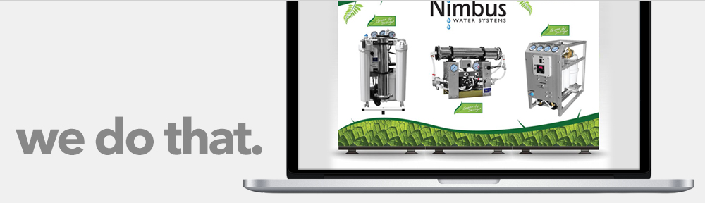
Now, why do we need to mask? Quite simply to make subjects appear cleaner or to use them on backgrounds for which they were not intended. I mask a lot of product photos. Often the background of these photos is not the best. Poor lighting, odd placement and other quirks lead to an useable photo. Luckily, we can mask all of that unwanted ugliness, and be left with an image perfect for an online store.

When I first started my career in graphic arts, I was trained in the techniques of paste up. That is, physically cutting and altering artwork to fit your needs. I guess it was needed for all of that old hardcopy artwork that was lying around that never made its way to the computer. Beyond becoming proficient with an X-Acto knife (to the point where I prefer it over scissors), I saw little to no benefit from it.

I guess it could be said that the training did benefit me in the skills of digital image masking. It’s not quite different… you just happen to be using a mouse instead of a knife and glue.

So how do I mask? I’m not sure how others do it, but I have a preferred method that produces remarkable results. With a mix of Photoshop and Illustrator, you can create masked images that dazzle your clients.

For the purposes of this tutorial, our desired result is a transparent background. This is beneficial in both online and print materials. If a client sends me artwork in high resolution, I will keep the image’s original size, and mask to transparent backgrounds. This saves me from having to re-mask if the client wants to use that image in future print materials.

Step 1: Get your image ready.
After receiving the image from the client, open it in Photoshop to verify resolution. If the image is high res, but set to 72dpi, set the resolution at 300dpi at the same pixel dimensions. Select the entire canvas and cut, then paste. This will create a new layer with your image. Delete the Background layer. Save your image as a Photoshop file with layers.

Step 2: Fire up Illustrator
Create a new Illustrator document that is larger than your image. Place your image onto the page. Set your zoom level to 300%, choose your path tool, and set the border and background colors to none.

Step 3: Create your clipping path
Using the path tool, outline the part of the image you want to keep. Make sure to stay very close to the edges of the piece you are masking, removing any shadows that might be present from bad lighting. After you have outlined all parts of the image you want to keep, set the fill the white with no stroke. Also create a small white box, with no stroke and align it at the top left corner. Select your paths and the small white box and copy that to the clipboard. Note: I have increased the transparency of the image to better show the clipping mask.

Step 4: Get back into Photoshop
Open the same Photoshop file (the one you placed into Illustrator) in Photoshop. Paste your clipping paths from Illustrator, creating a new layer. They will be pasted centered in the canvas area. Using the white box in the top left corner, move the layer so that the white outlines snap to that top left corner, perfectly covering what you want to keep.

Step 5: Select Inverse
Select and delete the white box in the top left corner, it has served its purpose. Select the entire canvas and hit your up then down arrow on the keyboard. This will make a selection of just the white areas. Choose Select > Inverse. Go to your Layers palette and choose the original image layer and hit the delete key. Choose the clipping path layer, and delete that layer. What you are left with is a perfectly masked image with a transparent background.

Now you can do whatever you want with that image. You can place it on a different background, collage it with other products, or apply image effects such as drop shadow. There is no limit to the possibilities.

So there you have it, what I consider the easiest, cleanest, fastest way to mask a product image.

This has been today’s Clarified Butter.

Second Time’s a Charm? Who knows…

Clarified Butter

Yes, this is the second time I’ve started a blog for ProGravix. The first iteration was developed and maintained using Google’s Blogger service, although all site files were hosted on ProGravix’s servers. Google discontinued their service where you could host your blogs on remote servers, and when that happened, I just decided to close down the blog. I should have kept the posts I had there, but maybe a fresh start is for the best.

I’m not exactly sure on how this blog will be used. I do my best to post current projects, and their finalized artwork, on Facebook for all to see. (Facebook has turned into a really cool way to share what we are up to). I guess the intent of this blog will be discovered over time.

This month marks the 12th year that ProGravix has been providing design services full time. Although the current market is troubled, it certainly feels good that ProGravix grows stronger each year. We’ve yet to discover if our growth has outpaced this recession, or if we are not affected by it. I venture to guess that it’s probably a little bit of both.

For the first several years, ProGravix offered graphic design services, limiting itself to printed material. Several years later came web development, which is now the largest part of our business. I must say, however, that the increase in our popularity was driven with extremely crazy offerings, such as logo design for $18.95. Since that time, we’ve create thousand of logos for companies all over the world, many of which have turned into satisfied repeat customers.

Another great success is our ability to grow without any sort of advertising. Certainly we take advantage of social media, search engines, and the like, however, we do not spend a single cent on advertising. Our customers are driven to us by other satisfied customer. It’s called effective Word of Mouth™, and it works.

Overall, I hope you become an avid reader of this blog. I will likely include tips and tricks for your design and web projects, and even share a little bit of what we are working on. I am excited that I have challenged myself with this new blog. Let’s see how long I can keep it up.

This has been today’s Clarified Butter.


Drew Lamont
Owner, ProGravix Digital Design
drew@progravix.com