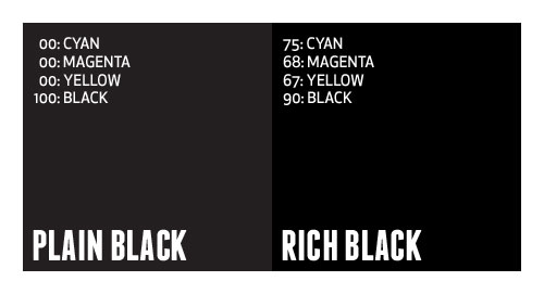
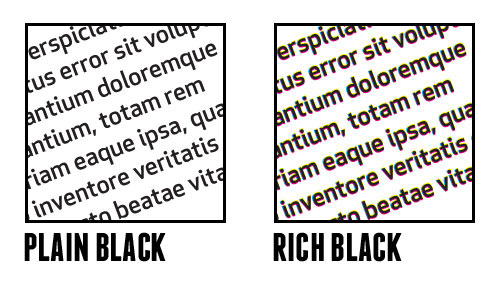
Black is black, right? I mean, as a child, you undoubtedly had a crayon labeled black. Obviously based on the size of your crayon set, you likely had many very weird color names, but there was only one black.
In graphic design, and more precisely print, there are many definitions of black. Generally, designers define in terms of CMYK, RGB, HEX, PMS, etc. When it comes to black, you really need to choose the right one based on what you are designing.
In general you can break black down into two categories, either pure, solid colors (such as Pantone or single inks) or percentages of several different colors to achieve black (such as CMYK). I call the pure, single color plain black, whereas the mix of colors is referred to as rich black.

What’s the difference?
In applications such as Illustrator and InDesign, where most typesetting generally occurs, default black is defined as 100% Black. In Photoshop, default black is generally defined as Cyan: 76%, Magenta: 68%, Yellow: 67%, Black: 90%. Many times, this rich, Photoshop-defined black is desirable to achieve a very dark black appearance (especially in glossy offset printing). Plain black can appear more gray in print, and can ruin an entire design.
So, why not always use rich black? Well, say you designed a piece that contains large amount of text, and you choose to color that text using rich black. You are creating a nightmare for the printer, and a potential rerun at a loss. Having defined that text using four different colors requires that the printer overlay those colors precisely on top of each other to create the rich black, which is very difficult to do (especially on thin or small fonts).

It’s best to use a complimenting mix of plain and rich black in one piece. Keep text in plain black, and large graphic elements in rich black. Just be careful with your rich black mixtures. Don’t get it just right, and you end up with greens tints to your black. There is a general disagreement about what is the proper mixture of rich black, but if Photoshop defines it as 75/68/67/90, I’m happy to agree.
This has been today’s Clarified Butter.
