iPod touch, we speak your name

Okay, first my gripe. To all those previous Apple haters, who are now Apple lovers, it’s called an iPod touch. It’s not an iTouch. Never has been, never will be. Are you really that busy that you cannot properly spell out or say the proper product name?

But I digress.

I’ve been a proud owner of an iPod touch 3rd Generation since September 2009. I use this thing religiously. I likely use it more than my Mac Pro, and that’s saying a lot. Over the last few weeks, my internal battery has been dying, and I couldn’t even make it through 1 hour on a full charge. After considering all of my options, I decided to buy a battery, and replacing it myself. This would mean cracking my iPod open, and hopefully not have any parts left over (which is a common occurrence when I tackle such a task). The uneasiness came when I realized the battery was soldered onto the board. I’m fairly competent when it comes to soldering, but this thing has some very small connectors (three in all). I watched several videos and read many blogs explaining how to replace the battery. Seemed pretty easy. The glass and digitizer was very difficult to remove, even with the safe pry tools.

And this brings us to the meat of this post.

I want to warn you of a very important step, which doesn’t seem to be explained very well in all of the videos and blogs. The digitizer has a very fragile ribbon, and if you are not careful, you can easily tear it, which is what I did.
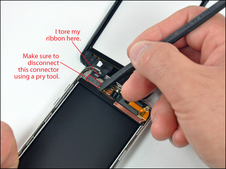
Make sure you use a pry tool to carefully disconnect the ribbon and connector from the board. One video I saw said to gently pull on the ribbon to disconnect it. This is what I did, and my ribbon easily tore.

Now, although I have an iPod touch that will charge, and hold a charge, I have no way of controlling it with touch. My only option is to control audio only with the earphone-inline-remote.

I have a new digitizer assembly on it’s way, and hopefully I can swap it out without making any more damaging mistakes.

This has been today’s Clarified Butter.

Serif vs Sans-Serif: They each have their place

One of the most difficult obstacles to overcome is getting your client to trust your artistic and creative judgement. After all, they are coming to us for a specific reason: They have little (or don’t trust) personal creativeness. Knowing that a very high percentage of our clients made their way to ProGravix via Word of Mouth™, this usually can be overcome with very little persuasion.

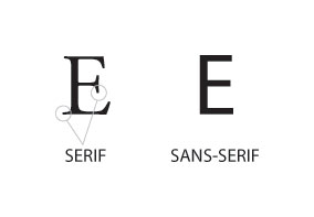
As an example, many clients prefer to specify specific design elements that they prefer, namely fonts. I’ve had several clients expressly request that I use a font such as Arial or Calibri for chunks of text. They see a font, and think it looks clean or neat, and wish to use it throughout. The problem is that these fonts, known as sans-serif fonts, are difficult to read when used in large groups of words (such as paragraphed text). The solution is to use a serif font. But what’s the difference?

Serif fonts are those that have the little stylized ‘feet’ at their base and throughout the corners and ending points of the character. Sans-serif fonts are great for headlines, callouts, and other minimum word areas. And when used sparingly, all caps is appropriate. An example of this would be headlines in a newspaper. Alternatively, all caps serif fonts tend to be difficult to read. Look at nearly all standardized road signs. They all use Helvetica, all caps. Yes, I am sure some municipalities stray from this international standard, attempting to present their roadways and byways in a rustic or colonial fashion, but overall ‘caps sans’ is where road signs are at.

And although this does not really follow the same topic, there is another piece of advice I’d like to share: There is only 1 space after a period (or any other sentence ending punctuation mark). Now just stay with me here… Back when I first learned to type, it was on an IBM manual typewriter. And at that time, the rule was to place two spaces after a period. But why? Well, in those manual typewriter days, the font used was always monospace, such as Courier. Monospace means that all characters, punctuation, et cetera, used the same exact width. So, two lower case L’s would appear very far apart, while two capital W’s, would appear squished together. So, the thinking was that those two spaces after a period would visually present a new sentence, and in theory allow you to more easily read the text. Nowadays, with computers, we should only be using a single space after periods. See, the computer is smart enough to know what spacing should be implemented along with that period and single space, based on the font in use. Yes, if you MUST use a monospace font (and they are certainly around), still use the double-space method. Not because the computer is suddenly space-period-dumb, but because this is obviously the look you are going for: horribly stylized ransom note.

This has been today’s Clarified Butter.
PDF Anomalies

I had a client with a recent PDF artwork problem. Usually PDF is a great way to share artwork across platforms, and more and more printers are preferring it. The problem is that PDF can be finicky. There are hundreds of PDF creators, distillers, and readers. Quite a few of them have quirks that don’t play well with each other. If created properly, PDF is great. On the other hand, there can be font issues, transparency loss, color matching problems, and much more.

My recently problem was with the client’s logo, which, only on their end, would print oddly, and inconsistently. My first thought was their reader, thinking it was either a non-Adobe reader, or not up-to-date. Turns out, that they are all up-to-date, and the issue had been replicated with another individual. The problem is that I could not replicate the issue. To this date, a vector PDF solution has not be found.

So what is the solution? Rasterize.

Rasterizing is the method where you convert vector to pixels. For example, converting an Adobe Illustrator line drawing to Adobe Photoshop. Whenever I create artwork where I am concerned with coloring matching or other PDF anomalies, I prefer to convert the artwork to CMYK TIFF. This way, what I see, is what the client gets from the printer. It allows me to verify color, trim, fonts, placement, and much more. There is no need to provide any additional embedded image, or be concerned with fonts, since the entire artwork is within a single flat file.

To solve the problem where printers exclusively prefer PDF, I bring the vector artwork into Adobe Photoshop to rasterize, then save as a Photoshop PDF.

Another recent example was with some business cards which used a brushed steel image as a background. The text was overlaid in white, with an Illustrator created drop shadow. An issue arose with the drop shadows, where thin white lines appeared around the drop shadows. Again, this did not show on the PDF I created, but once the cards were printed, it appeared. I converted the artwork to CMYK TIFF, and the cards were printed correctly, with the added bonus that the company’s trademark red color was vibrant and accurate.

So, when all else fails, rasterize.

This has been today’s Clarified Butter.

Second Time’s a Charm? Who knows…

Clarified Butter

Yes, this is the second time I’ve started a blog for ProGravix. The first iteration was developed and maintained using Google’s Blogger service, although all site files were hosted on ProGravix’s servers. Google discontinued their service where you could host your blogs on remote servers, and when that happened, I just decided to close down the blog. I should have kept the posts I had there, but maybe a fresh start is for the best.

I’m not exactly sure on how this blog will be used. I do my best to post current projects, and their finalized artwork, on Facebook for all to see. (Facebook has turned into a really cool way to share what we are up to). I guess the intent of this blog will be discovered over time.

This month marks the 12th year that ProGravix has been providing design services full time. Although the current market is troubled, it certainly feels good that ProGravix grows stronger each year. We’ve yet to discover if our growth has outpaced this recession, or if we are not affected by it. I venture to guess that it’s probably a little bit of both.

For the first several years, ProGravix offered graphic design services, limiting itself to printed material. Several years later came web development, which is now the largest part of our business. I must say, however, that the increase in our popularity was driven with extremely crazy offerings, such as logo design for $18.95. Since that time, we’ve create thousand of logos for companies all over the world, many of which have turned into satisfied repeat customers.

Another great success is our ability to grow without any sort of advertising. Certainly we take advantage of social media, search engines, and the like, however, we do not spend a single cent on advertising. Our customers are driven to us by other satisfied customer. It’s called effective Word of Mouth™, and it works.

Overall, I hope you become an avid reader of this blog. I will likely include tips and tricks for your design and web projects, and even share a little bit of what we are working on. I am excited that I have challenged myself with this new blog. Let’s see how long I can keep it up.

This has been today’s Clarified Butter.


Drew Lamont
Owner, ProGravix Digital Design
drew@progravix.com