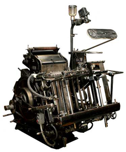
Press ready art: general guidelines

Over a decade ago we used to prepare files for film producers, to create negatives from which metal plates were made for the purposes of offset printing. Long gone are the days of right-reading, emulsion-up, negative specs (at least for us). I remember dropping off a ZIP disk (remember those?) to a service bureau, having the receiver tell me that my files were always perfect. She explained that I always provided the necessary fonts, embedded images, and such. This resulting in a much faster turnaround time.

Nowadays, practically everything is digital, from design to press. This helps smooth out pre-flight issues, but there are still some general rules that you must follow in order to meet a print shop’s requirements. A lot of press houses provide templates and specific guidelines for their purposes, but in general, these will help you avoid any hiccups.

Bleeds
A bleed is the extra artwork that extends past the trim mark. In general, a 1/8″ bleed is sufficient. Some printers request 1/4″, but that is typically reserved for larger booklets or manuals.

Trim marks
Trim marks (also referred to as crop marks or registration marks) are those guides at each corner of the printed piece that show the final cut size. In full color printing, these help with registration, showing that all colors are being printed perfectly in sync.

Resolution
In general, raster artwork should be developed at 300dpi. Some large scale items such as trade show booths and banners can be developed at 150dpi, but I recommend checking with the manufacturer of those items. Artwork developed in Illustrator in usually resolution independent. However, raster items, such as drop shadows, should be set at 300dpi.

Outline text or provide fonts
To resolve any font issues that may arise, convert all text to outlines. In applications that do not support this, make sure to provide all fonts used in the piece. In general, a PDF Press Ready file will include the fonts, but some fonts have licensing restrictions, and cannot be embedded in PDF files.

CMYK
Unless otherwise directed by the printer, your artwork should be in the CMYK color space. Most full color artwork is printed on a four color offset press. Make sure your artwork is in CMYK mode from the very beginning. Transitioning from RGB halfway through a project’s development can produce unwanted color issues.

File format
The industry standard artwork format is PDF Press Ready. Again, you should check with your printer, but the PDF format is widely supported across all platforms. For the most part, what you see is what they will see, but again, it’s not foolproof. If you have a very complex file, I recommend converting it to raster, providing the file in TIFF format.

This is just a few general guidelines. Again, check with your printer. In most cases, we don’t know who the printer is until we are asked to provide artwork. In can be difficult to go back and implement some of these tips, so keep them in mind.

This has been today’s Clarified Butter.

Facebook Cover Photo Template

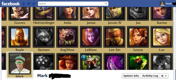
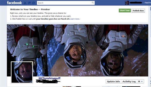
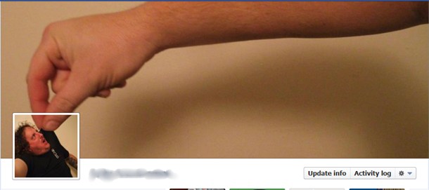
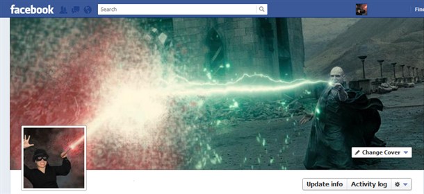
Several days ago I wrote about the new Timeline layout that Facebook is implementing across all profiles and pages. I detailed some steps, providing the dimensions of the cover photo. Since then, I’ve come across several Timeline layouts (cover/profile photo combos) that really took this to the next level. Here are a few…

As you can see, some creative souls out there are really taking advantage of this new layout.

To help this along, I’ve decided to provide a layered Photoshop template (Windows: rick-click and choose Save As…, Mac: option-click or right-click), which should help get you up and running quick. Don’t forget to come back and leave your Facebook URL in the comment box so I can take a look. I’m excited to see what you guys come up with!

This has been today’s Clarified Butter.

9 tips for creating an eNewsletter or HTML email

We create several HTML newsletters each month. All have their own unique look and feel, but do share some general rules that provide compatibility across the majority of browsers, clients, platforms, and systems.

Here we will cover some of those rules. I will note, however, that these are my general rules, and not necessarily practiced or enforced by all.

Set a defined width
Since most emails are received within an email client or web-based email service, you can’t be guaranteed of the space available for your content. You could obviously set a width of 100%, and let your content scale with the user’s display area, but in reality this can wreak havoc on any design you are trying to retain. In general, you want to keep your layout within 550-650 pixels. I use a fixed width of 600 pixels. This allows me to create content that is exactly 600 pixels wide, and will look exactly the same regardless of who is viewing it.

Use inline styles
When developing a website, every developer would cringe at the thought of using inline styles, but in the email world, they are your best friend. On a website, you’d create classes and share them among all of the pages on your site from a central file. Unfortunately, in an email, clients strip or won’t render those classes. So, make sure to define all fonts, sizes, coloring, et cetera using inline styles.

Use tables
Again, another no-no in the website world, becomes very helpful with HTML emails. Email clients are dated applications. They don’t render global CSS very well, and don’t keep up on standards. It’s best to organize your content using tables, as opposed to DIVs or other structuring methods.

Forget about background images
This might seem like a good idea at first, but again, most email clients won’t render them, and you will be left with an email that is either a horrible design, or simply not readable.

Don’t set specific dimensions for your images
Most web-based email clients will not display inline images by default, and instead ask the user’s permission before displaying them. The best course here is to not define the image’s height and width. This will reduce the amount of white space that is seen before the user hopefully allows those images to load.

Use ALT tags
ALT tags are assigned to images and other elements. When the user has images turned off be default, and you have properly defined ALT tags, those tags will be used in place on those images until they load. Make sure to use ALT tags that describe or match the image.

Don’t use Javascript
Plain and simple, don’t even try. It won’t work, and will only increase the chances that your email gets flagged as spam.

Include a plain text option
I personally prefer to receive all email as plain text. If I want to view the HTML version, I turn it on. Plain text lets me get to the content quicker. It’s easy to include both versions as one, single email, and the recipient’s client displays the version based on their local settings.

Keep it simple
That means content-and-design-wise. Keep huge blocks of text to a minimum. If you need to share more of a story, include a read more option, and link it to your site. In general, it’s easy to keep your design simple – the outdated email clients are enforcing that. Keep the use of images to a minimum, and make sure they are optimized to speed download time. Make sure to host your images on a server that is fast, and always available.

There you have it, 9 tips for creating an HTML email. Again, not standards-based rules, just ones I prefer to enforce locally.

This has been today’s Clarified Butter.
Add a Facebook Like button to WordPress blog posts

Adding a Facebook Like button to your non-Facebook content can greatly increase its ability to be more social, and be shared with a greater audience.

Here we will discuss adding a Like button to your WordPress posts. That is, a Like button for each individual post, and not for the entire blog (which is also a good idea to have in your sidebar). A Like button allows Facebook users to like specific posts on your blog, which in turn displays this as a story on their profile (and potentially on their friend’s feeds or tickers).

For the purpose of this post, we will be using the Twenty Eleven WordPress theme. This plugin will work across many other themes, but using this theme, and similar themes, will allow us to better place where the Like button appears.

The first step is generating the Like button code to be added to our theme’s template files. Like button code can usually be created with the tool provided by WordPress. The problem is that the URL to define is dynamic, and we can’t specify a static URL. Luckily, each individual WordPress post has a defined Permalink, and we just need to make a request for that URL.

Here is the code you need to use. I’ve already embedded the Permalink code. Copy this to your clipboard:

<iframe src="http://www.facebook.com/plugins/like.php?href=<?php echo urlencode(get_permalink($post->ID)); ?>&amp;send=false&amp;layout=button_count&amp;width=150&amp;show_faces=false&amp;action=like&amp;colorscheme=light&amp;font=trebuchet+ms&amp;height=21" scrolling="no" frameborder="0" style="border:none; overflow:hidden; width:150px; height:21px;" allowTransparency="true"></iframe>

Now, in WordPress, login to Admin and go to Appearance > Editor. Under Templates click on the content.php file. This is the file used to display the posts on the main index page of your blog.

Paste the code just after the </h1> tag, which is the title of the post. Click Update File to save your changes. Now visit your blog’s main page to see the Like button in action.

Next, open the content-single.php file and paste the same code before the <h1> tag. This template file displays a single post’s content. I prefer the look of the Like button above the post title on single-post pages, but you can add it anywhere you prefer. Click Update File to save your changes.

Now, on your blog’s home page, click on a post’s title to see the full post in the single-post layout. You will see the Like button above the post’s title (or wherever you placed it).

There you have it, a simple implementation of the Facebook Like button on your WordPress blog. Now, write some really neat-o blog posts worth liking, and put Facebook to work for you.

This has been today’s Clarified Butter.

Create the perfect cover photo for Facebook’s new Timeline layout

Regardless of whether you like it or not, everybody will eventually have the new Timeline layout for their Facebook profile or page. I personally like it. I think the layout is cleaner, and provides more flexibility when it comes to customization.

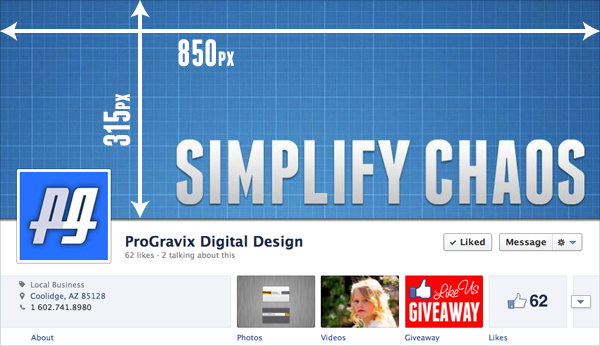
A major part of the new layout is the Cover photo, which is the large image that encompasses the top 315 pixels of your profile/page (excluding the Facebook bar across the top). Choosing what to place here is much more than choosing a photo from your existing albums, or uploading a plain photo. The key is developing an image that better explains yourself or your business.

Choosing what to design can vary widely, but should be focused on what you want to emphasize or portray about yourself or business. For a Business Page, you might want to include a series of photos that relate to the products or services that you offer. Here at ProGravix, we chose to use an image that mimics the look and feel of our website, which currently emphasizes our mantra, Simplify Chaos.

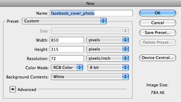
To get started, fire up your favorite graphics application. We chose Photoshop CS5. Create a new document with a size of 850x315px.

What you do next is up to you. Be creative! Can’t? Well, that’s where we can help. If you need assistance in developing a cover photo, please contact us. You’ll be glad you did.

When designing, make sure not to place any important content, such as text, where the profile photo is, which is on the bottom left of the cover photo. Any content placed here in the cover photo will be covered up by the logo.

Whatever you design, make a statement with your cover photo. Just because it’s a static image doesn’t mean it should be plain. As always, keep it simple and clean!

This has been today’s Clarified Butter.
Create a custom Facebook Business Page Tab for the new Timeline layout

Facebook recently announced that Facebook Pages for Businesses will be receiving the same new Timeline layout that personal accounts have had for some time now. I know, I know, most of you are getting sick and tired of the constant changes over at Facebook, but I think this new layout is awesome.

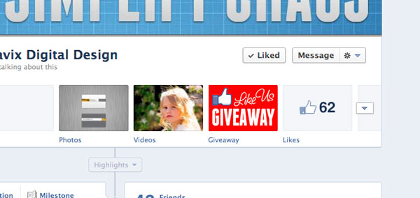
Over the past couple of days, I’ve been trying to figure out how to add a custom Page Tab in this new layout. Page Tabs are those rectangular thumbs below your cover photo (which include a tab for Photos and Likes by default). Any apps you have installed would also be presented here.

I could easily create the Page (the actual page that shows the content), but getting the actual Tab to show up on my Facebook Business Page wasn’t so easy…

In this post, we’ll be discussing how to create a Page Tab to display custom content inside of Facebook. In other words, create a website page within Facebook that is associated with your Business Page. This is useful if you want to post a coupon, promotion, or other content that doesn’t fit elsewhere on your Facebook Business Page.

The Page Content
Before you do anything, you need to create the actual content to display within the Facebook page. I won’t go into specifics with this, since this is outside the scope of Facebook (and this post). In general, you need to create an HTML page, using any technology you prefer, such as HTML, CSS, PHP, JS, etc. My only suggestion is keeping the content no wider than 790px. It’s also best not to have the content very tall. If you do, those ugly iFrame scroll bars will likely appear. Once you have your content developed, it needs to be available online. If you need help developing the content, and/or adding it to Facebook, please contact us.

For the purpose of this tutorial, let’s assume your content is created and available at http://www.example.com/facebook/index.html.

The Facebook App
Don’t go running off now! Yes, we are going to create a Facebook App, but only for the purpose of creating the Page Tab. You don’t need to be a developer, or know anything beyond what you already have in your noggin. Go to https://developers.facebook.com/apps and click on Create New App.

Enter a name for your App. This isn’t really important, since you are going to be the only one that sees it. Also, namespace is not needed since we are just creating this app for a Page Tab. Click Continue, and complete the CAPTCHA security check.

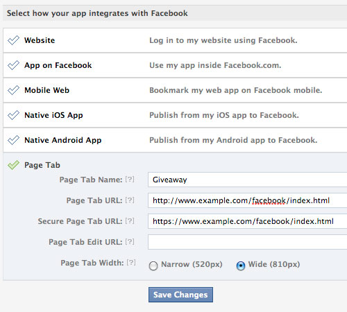
On the Basic Settings page for your newly create app, no further information is needed under Basic Info, so click on the Page Tab selection at the bottom.

For Page Tab Name, enter the name you would like to appear below the button on your Facebook Page.

For Page Tab URL, enter the URL where the content exists on your server. Our example above was http://www.example.com/facebook/index.html.

For Secure Page Tab URL, enter the SSL URL where the same content exists on your server. This would be a URL that starts with https://. For example, https://www.example.com/facebook/index.html

You can leave Page Tab Edit URL blank, choose Wide (810px) for the Page Tab Width and click Save Changes.

Now, the part that was nearly impossible to figure out. I’m not sure why Facebook doesn’t provide a way to install the app to your page from within the app’s settings page. Maybe this is a glitch that will be cleared up soon. While you are still on your app’s basic settings page, make a note of your App ID and Page Tab URL (which in our example is http://www.example.com/facebook/index.html). Open a new browser window and go to:

https://www.facebook.com/dialog/pagetab?app_id=ENTER_APP_ID&next=ENTER_PAGE_TAB_URL

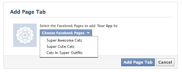
Make sure to replace ENTER_APP_ID and ENTER_PAGE_TAB_URL with your variables. Hit enter, and then choose the page you wish to install your new App to.

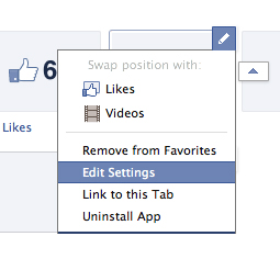
Now, go back to your Facebook Business Page. You will now see the new Page Tab button, and the name you chose below it. As of right now, it shows the default Facebook App icon. To change this, click on the triangle to the right of your page tabs, then hover over the new tab and click the pencil to pull up the options. Click Edit Settings. When the new window appears, click on Custom Tab Image and follow the steps.

Test your new Page by clicking on the Page Tab. The content you have posted to your server will now be displayed within Facebook.

This is a simple implementation of a Facebook Page Tab. Page Tabs can be enhanced to perform many advanced functions. The most popular is a like-gate, where you hide content, such as coupons or promo codes, from visitors until they Like your page. Hopefully a future blog post will cover this, but for the time being, I think getting this far using the new Timeline layout for Facebook Business Pages is a huge accomplishment.

To see an example of a working like-gate experience, head on over to our current promotion on Facebook (promotion has expired). This is using the same method we just outlined, with the added like-gate code (wherein we hide the entry form from the visitor until they like our page). While you’re there, like us so you can be entered to win a Professional Logo Design Package, valued at over $350!

This has been today’s Clarified Butter.
Plain Black vs Rich Black

Black is black, right? I mean, as a child, you undoubtedly had a crayon labeled black. Obviously based on the size of your crayon set, you likely had many very weird color names, but there was only one black.

In graphic design, and more precisely print, there are many definitions of black. Generally, designers define in terms of CMYK, RGB, HEX, PMS, etc. When it comes to black, you really need to choose the right one based on what you are designing.

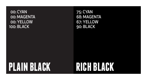
In general you can break black down into two categories, either pure, solid colors (such as Pantone or single inks) or percentages of several different colors to achieve black (such as CMYK). I call the pure, single color plain black, whereas the mix of colors is referred to as rich black.

What’s the difference?
In applications such as Illustrator and InDesign, where most typesetting generally occurs, default black is defined as 100% Black. In Photoshop, default black is generally defined as Cyan: 76%, Magenta: 68%, Yellow: 67%, Black: 90%. Many times, this rich, Photoshop-defined black is desirable to achieve a very dark black appearance (especially in glossy offset printing). Plain black can appear more gray in print, and can ruin an entire design.

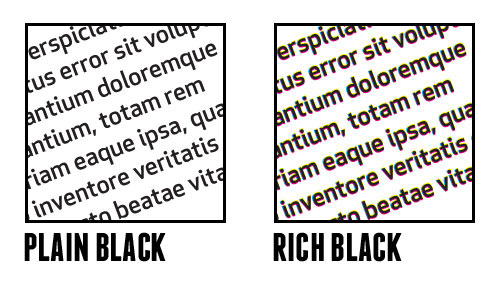
So, why not always use rich black? Well, say you designed a piece that contains large amount of text, and you choose to color that text using rich black. You are creating a nightmare for the printer, and a potential rerun at a loss. Having defined that text using four different colors requires that the printer overlay those colors precisely on top of each other to create the rich black, which is very difficult to do (especially on thin or small fonts).

It’s best to use a complimenting mix of plain and rich black in one piece. Keep text in plain black, and large graphic elements in rich black. Just be careful with your rich black mixtures. Don’t get it just right, and you end up with greens tints to your black. There is a general disagreement about what is the proper mixture of rich black, but if Photoshop defines it as 75/68/67/90, I’m happy to agree.

This has been today’s Clarified Butter.

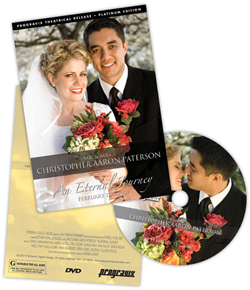
First impressions: the DVD packaging

I think we have a unique situation here at ProGravix. Seeing as how we are graphic designers and web developers, we have an advantage over other videographers that don’t share this same skill set. First, and foremost, we are graphic designers. This bleeds over into web development. But how can it help with videos we create? Tons. Certainly the actual capture, editing, and display of that video is a substantial part of the project. But I think making an impact with the packaging is extremely important. As graphic designers, we use our expertise to create engaging, studio quality DVD cases and faces that invite the viewer in, and give an impression that what they are about to watch is an important keepsake.

Providing a physical package that you can touch, feel, and see grabs the customer, and potential customer. It tells them that what they hold in their hands is a one-of-a-kind heirloom. A polished, personal project that can be presented in their home for anyone to see, without the need to watch.

I’ve seen other videographers write the name of the client or project on the face of the DVD with a marker, or drop it in a DVD sleeve along with a business card. I think it’s important to let your customer know that you were fully invested in their project. You used every ounce of creativity you had to create something that you are personally impressed with.

Aside from wedding videos, a lot of videos we create are gifts. It’s important that the gift be something impactful when presented or opened. You want the recipient to be excited about that gift, without the need to immediately watch it. You want the packaging to entice the receiver to want to watch it.

So, please videographers, put down the marker and make a presentation with your video and packaging. If you don’t know how, let us know, we’ll be happy to help out.

This has been today’s Clarified Butter.
Present proofs with impact

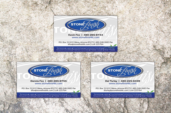
We provide 100% of our proofs digitally, over the web. It’s important that you create a proof that helps present all that encompasses your design. With all items, even those intended to be flat, such a business cards, it’s still important to go beyond the design of the piece, and present it in a real-world environment. What would that card look like on a client’s desk? How will that box present itself in a retail environment?

The majority of proofs we create are displayed online, via a custom proofing area for that specific project or client. This affords us the ability to use web development techniques to create a dynamic presentation.

When we develop a logo, usually creating four or five different concepts, we take our favorite and develop letterhead, envelope, and business cards. These pieces fully integrate the logo. In the end, they might not accept that logo, but it gives them the insight that other ideas can be just as, if not more, engaging.

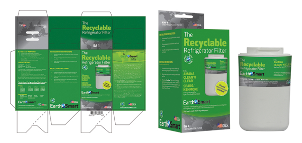
We develop a lot of packaging material. Certainly flat proofs are sent so that they may review the actual printed content, but it’s also important to present that packaging in a real world example. This helps the client understand your design, explaining why you used the colors you did, or why you wrapped certain elements around the box. We’ve had clients question a design, but not until they saw the real world example did they really understand and accept the design.

It might be difficult or seem like an unnecessary step, but in the end, it will really help push the ideas that you create. As designers, it’s difficult for us to get the client to envision what we see. This is a simple way to accomplish that. And, if you haven’t noticed, we love simple.

This has been today’s Clarified Butter.

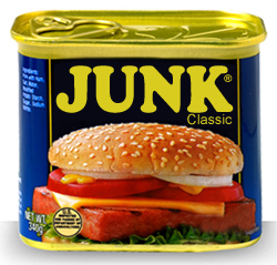
Spam, we hardly knew ye

You’d think that having such a dominant online presence, I would be much more susceptible to spam. The truth is, I hardly ever see it. You’re probably sitting there wondering what the heck I am talking about. Everybody gets spam, right? We’re always clogged up with viruses, avoiding overseas scams, and constantly shuffling through our junk folder to find that one good email accidently flagged as naughty.
Not me.

First off, we use Macs here, running one flavor of Mac OS X or another. We’re insane about our backup techniques, and never download anything from the internet unless it’s from a reputable source. So, let’s throw the fear of viruses right out the window.

I came across this solution when I was trying to solve a problem with iOS not having a junk mail feature. I had never used the Junk Mail feature in Mac Mail, my preferred email client, and preferred to let everything accumulate in my inbox. This was fine at first, but when the spam really started to flow, I needed a solution. That solution couldn’t be based on Mac Mail’s junk mail feature, because I never wanted the spam to be downloaded in the first place. This meant that it had to be taken care of at the server level.

We use Google Apps for our email and other online needs, but for the purposes of this post, Gmail functions exactly the same way. We need to setup a filter within Gmail that stops the spam from ever getting sent to our inbox.

If you don’t have Gmail (or Google Apps) I highly suggest you get it, and forward all your mail there. It’s up 99.9% of the time, and dang easy to setup and use.

Let’s set this up.

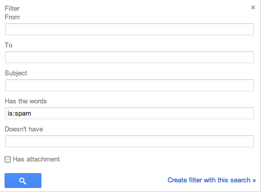
After you’ve logged into Gmail, go to Settings and click on the Filters tab. Click ‘Create a new filter.’ In the resulting window, enter “is:spam” (without the quotes) in the ‘Has the words’ field and click on ‘Create filter with this search.”

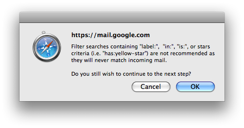
A dialog will pop up warning you that using “is:” will never match incoming mail, but I can assure you, it does. Click ‘OK’.

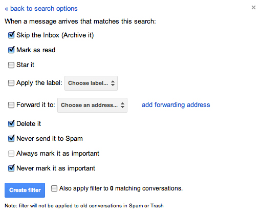
On the next window, check the following:

  • Skip the Inbox (Archive It)
  • Mark as read
  • Delete it
  • Never send it to Spam
  • Never mark it as important

This will put all mail that Google considers spam into the Trash folder. It will appear as already read (so you won’t have any unread flags). This is also good because Trash is automatically deleted in 30 days, so you never have to go in and manage your junk mail. It also gives you a 30 day window to find any messages inappropriately flagged as spam. I can tell you, however, that for me, not once has a legitimate message been flagged as spam by Google. All my junk goes directly to the trash and I never see it.

Now, just to get a similar setup with my local Letter Carrier. Maybe she can put it right in the recycle so I don’t have to touch it.

So, there you have it, a great solution for spam management that’s easy and effective.

This has been today’s Clarified Butter.