Superscript with style

One of the most annoying browser rendering flaws is that of the registered trademark (or any other text – such as footnotes) in superscript. It typically is way too large, throws off line spacing, and makes large blocks of text appear as though it’s been pelted with a shotgun.

Superscript

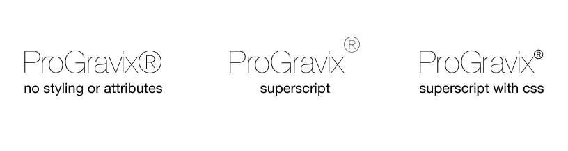
The registered trademark symbol, ®, is generally not superscript as a default, and must be wrapped in a <sup> tag to raise it up from the baseline, and make it slightly smaller. The problem is that it never quite gets small enough.

<p class="bodytext">ProGravix<sup>&reg;</sup></p>

The trick is to style the <sup> tag with CSS…

p.bodytext {
	font-family: Arial,Helvetica,Geneva,Swiss,SunSans-Regular;
	font-size: 10pt;
	line-height: 14pt;
	font-weight: normal;
	color: black;
}
sup {
	font-size: 6pt;
}

Here you can see that we have added styling to a stylesheet that tells superscript-tagged-text to render as 6pt. The code above that shows a “bodytext” class defined with a default text size of 10pt. You will need to adjust the <sup> font size based on your specific needs.

You can alternatively adjust the <sup> font size relative to the surrounding text using percentages. It’s also a good idea to zero out line-height, and adjust the position of the superscript.

sup {
	font-size: 75%;
	line-height: 0;
	position: relative;
	vertical-align: baseline;
	top: -0.5em;
}

If anything looks off for your specific use, just fiddle with the values. And when you think you’re done, check your work across as many browsers and platforms you can get access to. Honestly you should be doing this already – but let’s just assume you don’t already know that.

This has been today’s Clarified Butter.

Who do you recommend?

Creating a unique and eye-catching design for your print work is only part of the overall project. We’re constantly asked who we recommend when it comes to offset printing. In this digital age, you would assume that the need for physical materials would be diminishing. Nothing could be further from the truth.

A typical “branding” piece that is created after the development of a business identity and logo design is business cards. A business card is an affordable way to get the word out about your business. The quality of this card should reflect the service or products you offer. If your card looks cheap, so does your company. It’s important to choose the right printer – this is not a time to skimp. That’s not to say that it’s going to break the bank… just don’t choose the first “good deal” or “free” offer you see. For just a little bit more you can have amazing business cards.

Business Cards

For business cards, and any other full color printing, I recommend PrintRunner. They are based out of California, and offer incredible prices for immaculate quality. Of special note is the 14pt UV Coated or 14pt Gloss (AQ) Coated stock. Either of these options will provide a shiny, glass like surface – which will really make your colors pop. Of course they offer the typical Matte or Recycled paper options, which are great when you are trying to promote an earthy, “go green” feel.

I’ve used PrintRunner for postcards, business cards, letterhead, catalogs, banners, trade show booths – pretty much everything. We are not affiliated with PrintRunner, and make no profit for referring them. They are just that good.

So, when you are ready to get some physical materials printed – let us help design… then let us help you get it on over to PrintRunner. You’ll be happy you did.

This has been today’s Clarified Butter.