Plain Black vs Rich Black

Black is black, right? I mean, as a child, you undoubtedly had a crayon labeled black. Obviously based on the size of your crayon set, you likely had many very weird color names, but there was only one black.

In graphic design, and more precisely print, there are many definitions of black. Generally, designers define in terms of CMYK, RGB, HEX, PMS, etc. When it comes to black, you really need to choose the right one based on what you are designing.

In general you can break black down into two categories, either pure, solid colors (such as Pantone or single inks) or percentages of several different colors to achieve black (such as CMYK). I call the pure, single color plain black, whereas the mix of colors is referred to as rich black.
What’s the difference?
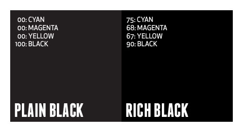
In applications such as Illustrator and InDesign, where most typesetting generally occurs, default black is defined as 100% Black. In Photoshop, default black is generally defined as Cyan: 76%, Magenta: 68%, Yellow: 67%, Black: 90%. Many times, this rich, Photoshop-defined black is desirable to achieve a very dark black appearance (especially in glossy offset printing). Plain black can appear more gray in print, and can ruin an entire design.

So, why not always use rich black? Well, say you designed a piece that contains large amount of text, and you choose to color that text using rich black. You are creating a nightmare for the printer, and a potential rerun at a loss. Having defined that text using four different colors requires that the printer overlay those colors precisely on top of each other to create the rich black, which is very difficult to do (especially on thin or small fonts).
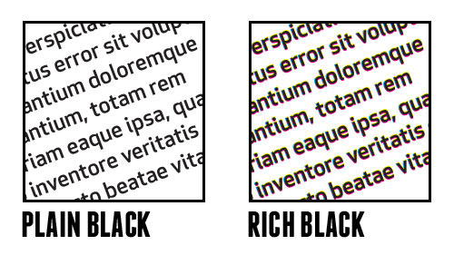
It’s best to use a complimenting mix of plain and rich black in one piece. Keep text in plain black, and large graphic elements in rich black. Just be careful with your rich black mixtures. Don’t get it just right, and you end up with greens tints to your black. There is a general disagreement about what is the proper mixture of rich black, but if Photoshop defines it as 75/68/67/90, I’m happy to agree.

This has been today’s Clarified Butter.

First impressions: the DVD packaging

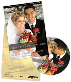
I think we have a unique situation here at ProGravix. Seeing as how we are graphic designers and web developers, we have an advantage over other videographers that don’t share this same skill set. First, and foremost, we are graphic designers. This bleeds over into web development. But how can it help with videos we create? Tons. Certainly the actual capture, editing, and display of that video is a substantial part of the project. But I think making an impact with the packaging is extremely important. As graphic designers, we use our expertise to create engaging, studio quality DVD cases and faces that invite the viewer in, and give an impression that what they are about to watch is an important keepsake.

Providing a physical package that you can touch, feel, and see grabs the customer, and potential customer. It tells them that what they hold in their hands is a one-of-a-kind heirloom. A polished, personal project that can be presented in their home for anyone to see, without the need to watch.

I’ve seen other videographers write the name of the client or project on the face of the DVD with a marker, or drop it in a DVD sleeve along with a business card. I think it’s important to let your customer know that you were fully invested in their project. You used every ounce of creativity you had to create something that you are personally impressed with.

Aside from wedding videos, a lot of videos we create are gifts. It’s important that the gift be something impactful when presented or opened. You want the recipient to be excited about that gift, without the need to immediately watch it. You want the packaging to entice the receiver to want to watch it.

So, please videographers, put down the marker and make a presentation with your video and packaging. If you don’t know how, let us know, we’ll be happy to help out.

This has been today’s Clarified Butter.
Present proofs with impact

We provide 100% of our proofs digitally, over the web. It’s important that you create a proof that helps present all that encompasses your design. With all items, even those intended to be flat, such a business cards, it’s still important to go beyond the design of the piece, and present it in a real-world environment. What would that card look like on a client’s desk? How will that box present itself in a retail environment?

The majority of proofs we create are displayed online, via a custom proofing area for that specific project or client. This affords us the ability to use web development techniques to create a dynamic presentation.

When we develop a logo, usually creating four or five different concepts, we take our favorite and develop letterhead, envelope, and business cards. These pieces fully integrate the logo. In the end, they might not accept that logo, but it gives them the insight that other ideas can be just as, if not more, engaging.

We develop a lot of packaging material. Certainly flat proofs are sent so that they may review the actual printed content, but it’s also important to present that packaging in a real world example. This helps the client understand your design, explaining why you used the colors you did, or why you wrapped certain elements around the box. We’ve had clients question a design, but not until they saw the real world example did they really understand and accept the design.

It might be difficult or seem like an unnecessary step, but in the end, it will really help push the ideas that you create. As designers, it’s difficult for us to get the client to envision what we see. This is a simple way to accomplish that. And, if you haven’t noticed, we love simple.

This has been today’s Clarified Butter.

My current favorite fonts

I saw a blog post the other day written by a designer, and he shared a set of fonts that he’d been partial to lately. I figured I would make a similar list, but let’s call it my current favorites, because, to be quite honest, a font only lasts as long as your favorite shirt that turns into vaporwear. I have a list of eight fonts that I tend to use quiet a bit. They are shown here in their native form (with loose tracking). When I use them within projects, they are usually altered quite a bit.

Enjoy…

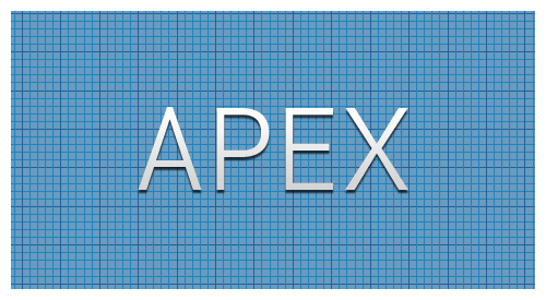
Apex. Here it’s shown as Apex Book, but it comes in flavors from Thin to Ultra. This is a great font for headers and other callout areas. I would say it’s not a good idea for body text or other areas where numbers might be used. The numbers within this font have a very mixed baseline, and are usually well below the baseline of their alphabetic companions.

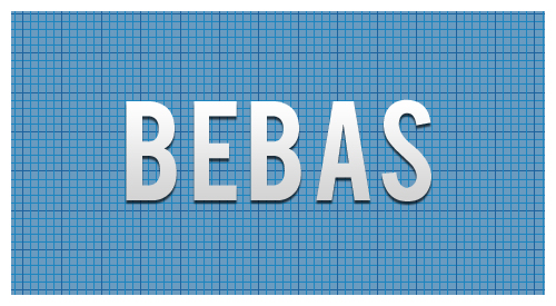
Bebas. Another great font for headers since it does not include lower case. You can fiddle with it to create a good looking small caps, but really this font looks best native, with a very loose track. Here it’s shown with a tracking of 40.

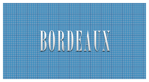
Borbeaux. Okay, so this font might not get a lot of use, but when you need something clean, crisp, and thin, this is your font. I recently used it across various spaghetti fundraiser materials, from tickets to posters and flyers.

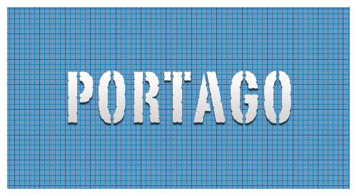
Portago. This is a great font for travel-based media. This is another font with only small caps, no lower case, so it’s use is limited to headers and callouts.

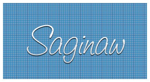
Saginaw. It’s rare to find a script font that reads well. Shown here in Medium, it’s also available in Light and Bold. Other than using it for mock-signatures, I really like it for designs that call for a wispy or light feel. It’s great for logos that need a similar feel.

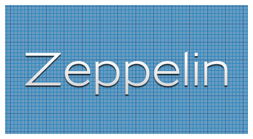
Zeppelin. This is a very versatile font. Shown here in 41, it’s available in widths and weights from 31 to 53. I love using this for small, uncluttered tables (such as specifications) where Helvetica or Arial would usually prevail.

Franchise. My current favorite of favorites. This is currently being used throughout progravix.com, and it looks great. Another font with only small caps (no lower case), but that’s fine with me. It looks great big and bold. I love using this on construction material, or huge display areas that demand your attention.

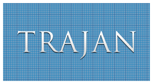
Trajan. I must really like fonts with all caps, or small caps, because here is yet another. This is a serif font, that really doesn’t have overbearing feet. This is perfect for announcements, or a very corporate look and feel. It’s an attorney’s perfect font, since any name looks great in it.

So there you have it, eight of my current favorite fonts. Out of the 1,238 fonts I have installed on my system, I think I did a good job whittling it down to eight. Makes me really think about recycling some of those unused fonts.

This has been today’s Clarified Butter.

Keep it vector, Victor

Vector graphics is the use of geometrical primitives such as points, lines, curves, and shapes or polygon(s), which are all based on mathematical expressions, to represent images in computer graphics. “Vector”, in this context, implies more than a straight line.

You know, I really love Wikipedia.

I try my best to keep illustrations vector, and with the seam-busting amount of tools in Illustrator, it’s a fairly easy task. I will agree, however, that raster images do have their place. But, when it comes to developing content that needs to be scalable, without the loss of quality, vector is where it’s at.

I probably spend 80% of my time in Illustrator, designing logos, box artwork, labels, trade show booths, and thousands of other items. If at all possible I can replicate a raster-technique using Illustrator, I do it.

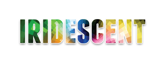
Recently, I was asked to create a logo where an element of the design had an iridescent finish. Iridescent is that rainbow reflection you get from stones and other materials. Most of us probably see it when crude oil and water are mixed. When the sun’s light reflects off the surface of the oil, the light radiates a rainbow shine that moves when the oil moves (or we move).

Now, accomplishing this in vector format might seem impossible, and given that this is a static image, how could we truly portray an iridescent appearance? It’s not important that the element look exactly like a real world example, rather that it portray itself as such. Thinking outside the box, or inside Illustrator, is where we need to focus. I chose to use varying shades of the iridescent colors to create boxes of increasing size on an arch, or more clearly, in a half-circle, where the boxes become increasingly larger the further they get from the bottom center. What we are left with is not a mixed gradient of the colors, rather a unique image that presents a multi-surface appearance.

So, in the end, we are left with a purely vector image that can be scaled to several thousand feet in width, if needed, with no loss of quality.

This has been today’s Clarified Butter.

Simplicity, a core value

Steve Jobs once said that one of the greatest ad campaigns, “Got milk?,” isn’t even about the product. It’s about the absence of the product. Now, think about that…

It’s true that some of the world’s best known brands are much less about themselves, and more about others who portray what the brand’s core value is. Marketing experts envision an entire ecosystem for the brand, from packaging and distribution, to dynamic retail displays. To me, establishing a new brand or corporate identity starts with a logo.

Now, you may think that a logo must represent a company’s products or service. This is not necessarily the case. In keeping with our simplicity ideology, less is more. Much more. It’s not a requirement that the logo actually include an illustration in-keeping with the brand’s genre. It’s much more important to design a logo that will be rememberable. For example, think about Nike, Target, or Tide. Their logos are clean, crisp, and very much rememberable. We know that the swoosh is Nike. Nike, and a slew of well paid marketing experts, made sure of that.

So how can we achieve this for your new brand? Invoke simplicity. Don’t overdo it. Many designers will, and those are the brands that will fail. If a logo is busy, cluttered and overbearing, the potential customer will feel the business shares these same attributes, and will look elsewhere.

So, if you are in the market for a logo or a identity refresh, let us help. It certainly can’t hurt, especially since we offer a 100% money-back guarantee.

This has been today’s Clarified Butter.

QR Codes: What the heck?

We’ve all seen them, and they’re becoming more heavily integrated into print with the prolific infiltration of smartphones and other mobile devices. But what is it, and how can it be used?
A QR code (abbreviated from Quick Response code) is a type of matrix barcode (or two-dimensional code) first designed for the automotive industry. More recently, the system has become popular outside of industry due to its fast readability and comparatively large storage capacity. The code consists of black modules arranged in a square pattern on a white background. The information encoded can be made up of any kind of data (e.g. binary, alphanumeric, or Kanji symbols).

Thanks again, Wikipedia!

QR codes are typically scanned by smartphones (or other mobile devices such as iPod touch) to direct the reader to a website or perform some other task more easily. For example, the reader can scan the QR code and be directed to your website without the need to actually type in the URL. This is done by using apps installed on the device. Qrafter, for example, is a good one. I prefer RedLaser. Different scanning apps provide different benefits. I like RedLaser because it can scan many different types of codes, including UPC bar codes, which then checks online (and sometimes local) resellers for the lowest price.

Beyond performing a cool, vital function, they also serve as a way to legitimize certain printed materials. I recently created some tickets for a Boy Scout Troop’s Annual Pancake Breakfast Fundraiser. The QR code simply directed the user to the troop’s website, but the purchaser of the ticket would assume it was a unique barcode number. This would inhibit the duplication of tickets and reduce fraud.

QR codes can be used to perform many functions. For example:

Browse to a Website
Bookmark a Website
Make a Phone Call
Send an SMS
Send an E-Mail
Create a vCard
Create a meCard
Create a vCalendar Event
Google Maps
Bing Maps
Geographical Coordinates
iTunes App URL
iTunes App Review URL
Android Market Search
Foursquare Venue URL
Youtube URL for iOS
Encode Latest Tweet of a User
Tweet on Twitter
Twitter Profile Image Overlay
Create Blackberry Messenger User
WIFI Network for Android
Free Formatted Text

So, now that we know how to scan them, how do we create them? I personally like the generator created by Kerem Erkan. It allows you to export the QR code to many formats, my favorite being vector EPS. This allows me to open the QR code in Illustrator, easily adding it to the client’s artwork.

It’s important to note that all of the data required to perform the action is stored in the QR code itself. No third party website or service stores the code behavior or tells the smartphone what to do. The scanner reads the QR code, decrypts it, then performs the action.

By the way, the QR code at the top of this post actually works. Give it a try. You should be taken to the mobile version of this blog.

This has been today’s Clarified Butter.

Organize and archive your workflow

When I first started in graphic design, back before CD burners and cheap platter storage, we used 3.5″ floppy disks to store customer’s digital artwork. We had a rack on the wall that held several hundred disks, all labeled and marked with numbers. Those numbers correlated with a database stored on the computer which listed what each disk held. It was quite cumbersome, but really all that was affordably available at that time.

Over the years we moved to larger tape drives, zip drives, flash, and so on, until we eventually came to DVDs and hard drives. We’re at the point now where regular consumers can have terabytes of storage, locally or on their network. And at prices that are remarkably cheap.

I’m very picky in the way I organize my files. All of my personal projects have their own folder. Business files have their own folder. Current websites have their own folder, as does current design and current video project. All websites are organized by domain, and all design projects are organized by client name. Any web sites or clients that are considered ‘dormant’ are moved to ‘archive’ folders. These archived folders are then moved onto DVDs for permanent backup. I should also point out, during all of this time, all files on every computer on our network are backed up in three places (delta, every hour), automatically. So, if a drive or DVD were to go bad, we could always find a replacement somewhere.

Now, when it comes to naming your files, be specific. I had someone chuckle when I used the accent marks on résumé instead of just typing resume. I had to explain that résumé (that important piece of paper you provide with a job application) and resume (starting a process which had been paused) are different. If I wanted to search my computer to find a résumé, it would be much quicker as all instances of resume would be removed.

Also, if you don’t know which project a piece is attached to, ask! It’s better to be organized when they come back 2 years down the road and want to make a change to the flow chart for the XYZ project. If you had simply named it ‘flow_chart_32’, it’s going to be a lot more difficult to find. Store it in a folder named ‘XYZ’ inside the client’s folder. This might seem overly simplistic, but I’ve worked with individuals that were very sloppy, and stored practically everything on their desktop. I’m not saying that’s bad, but ProGravix doesn’t allow it.

This has been today’s Clarified Butter.

Mask like a BOSS

Image mask, applied to digital images to “cut-out” the background or other unwanted features, created by using clipping paths.

Thanks Wikipedia!

Now, why do we need to mask? Quite simply to make subjects appear cleaner or to use them on backgrounds for which they were not intended. I mask a lot of product photos. Often the background of these photos is not the best. Poor lighting, odd placement and other quirks lead to an useable photo. Luckily, we can mask all of that unwanted ugliness, and be left with an image perfect for an online store.

When I first started my career in graphic arts, I was trained in the techniques of paste up. That is, physically cutting and altering artwork to fit your needs. I guess it was needed for all of that old hardcopy artwork that was lying around that never made its way to the computer. Beyond becoming proficient with an X-Acto knife (to the point where I prefer it over scissors), I saw little to no benefit from it.

I guess it could be said that the training did benefit me in the skills of digital image masking. It’s not quite different… you just happen to be using a mouse instead of a knife and glue.

So how do I mask? I’m not sure how others do it, but I have a preferred method that produces remarkable results. With a mix of Photoshop and Illustrator, you can create masked images that dazzle your clients.

For the purposes of this tutorial, our desired result is a transparent background. This is beneficial in both online and print materials. If a client sends me artwork in high resolution, I will keep the image’s original size, and mask to transparent backgrounds. This saves me from having to re-mask if the client wants to use that image in future print materials.

Step 1: Get your image ready.
After receiving the image from the client, open it in Photoshop to verify resolution. If the image is high res, but set to 72dpi, set the resolution at 300dpi at the same pixel dimensions. Select the entire canvas and cut, then paste. This will create a new layer with your image. Delete the Background layer. Save your image as a Photoshop file with layers.

Step 2: Fire up Illustrator
Create a new Illustrator document that is larger than your image. Place your image onto the page. Set your zoom level to 300%, choose your path tool, and set the border and background colors to none.

Step 3: Create your clipping path
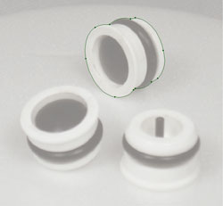
Using the path tool, outline the part of the image you want to keep. Make sure to stay very close to the edges of the piece you are masking, removing any shadows that might be present from bad lighting. After you have outlined all parts of the image you want to keep, set the fill the white with no stroke. Also create a small white box, with no stroke and align it at the top left corner. Select your paths and the small white box and copy that to the clipboard. Note: I have increased the transparency of the image to better show the clipping mask.

Step 4: Get back into Photoshop
Open the same Photoshop file (the one you placed into Illustrator) in Photoshop. Paste your clipping paths from Illustrator, creating a new layer. They will be pasted centered in the canvas area. Using the white box in the top left corner, move the layer so that the white outlines snap to that top left corner, perfectly covering what you want to keep.

Step 5: Select Inverse
Select and delete the white box in the top left corner, it has served its purpose. Select the entire canvas and hit your up then down arrow on the keyboard. This will make a selection of just the white areas. Choose Select > Inverse. Go to your Layers palette and choose the original image layer and hit the delete key. Choose the clipping path layer, and delete that layer. What you are left with is a perfectly masked image with a transparent background.

Now you can do whatever you want with that image. You can place it on a different background, collage it with other products, or apply image effects such as drop shadow. There is no limit to the possibilities.
So there you have it, what I consider the easiest, cleanest, fastest way to mask a product image.

This has been today’s Clarified Butter.

Color Correct Printing

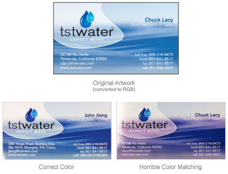
On two recent occasions I’ve had clients contact me with concerns they’ve had with the printing of artwork we’ve designed. In both cases, it’s been offset business card printing. The first client had been using a printer for years, successfully getting a brushed steel background to appear as a, well, brushed steel background, without the use of metallic ink. However, on a recent run, the background appeared more like a muddy green color. Certainly not what was expected, and nothing close to desirable.

After contacting the printshop, it was determined that they had changed their press since the last run. I had asked about color matching, and their response was pulled from their Terms & Conditions:

Color Proofing
Because of differences in equipment, paper, inks, and other conditions between color proofing and production pressroom operations, a “pleasing color” variation between color proofs and the completed job [as determined by generally accepted trade technical methods] is to be expected. When such a variation occurs, it will be considered acceptable performance.

The problem here is the phrase “pleasing color” that is considered “acceptable performance.” That is certainly up to interpretation. The good news, however, is that they have a 100% satisfaction guarantee. The client received all of their money back, including shipping, and took their job elsewhere.

With the other client, they had a background that appeared more purple on the newer cards, and color-accurate blue on the previous cards. Again, after contacting the printshop, they admitted that they too had changed their press.

This seems to be a widespread problem with these “online” printshop… offering incredible prices on business cards and other stationary items, with sometimes horrific results. Of course, true color accuracy could be achieved, but not by any of these more affordable printshops. Your best bet is to find a local printshop that will guarantee color correct printing. It’s going to cost you, but if having color accurate results is important to you, then it’s certain worth it.

This has been today’s Clarified Butter.