I saw a blog post the other day written by a designer, and he shared a set of fonts that he’d been partial to lately. I figured I would make a similar list, but let’s call it my current favorites, because, to be quite honest, a font only lasts as long as your favorite shirt that turns into vaporwear. I have a list of eight fonts that I tend to use quiet a bit. They are shown here in their native form (with loose tracking). When I use them within projects, they are usually altered quite a bit.
Enjoy…
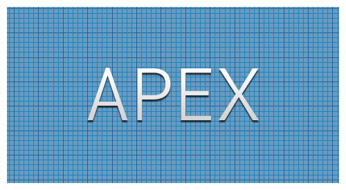
Apex. Here it’s shown as Apex Book, but it comes in flavors from Thin to Ultra. This is a great font for headers and other callout areas. I would say it’s not a good idea for body text or other areas where numbers might be used. The numbers within this font have a very mixed baseline, and are usually well below the baseline of their alphabetic companions.
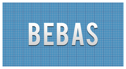
Bebas. Another great font for headers since it does not include lower case. You can fiddle with it to create a good looking small caps, but really this font looks best native, with a very loose track. Here it’s shown with a tracking of 40.
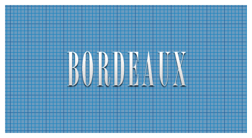
Borbeaux. Okay, so this font might not get a lot of use, but when you need something clean, crisp, and thin, this is your font. I recently used it across various spaghetti fundraiser materials, from tickets to posters and flyers.
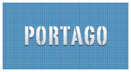
Portago. This is a great font for travel-based media. This is another font with only small caps, no lower case, so it’s use is limited to headers and callouts.
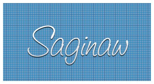
Saginaw. It’s rare to find a script font that reads well. Shown here in Medium, it’s also available in Light and Bold. Other than using it for mock-signatures, I really like it for designs that call for a wispy or light feel. It’s great for logos that need a similar feel.
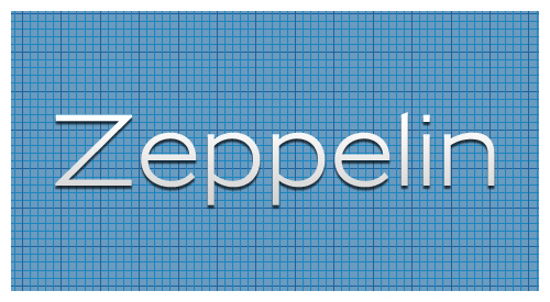
Zeppelin. This is a very versatile font. Shown here in 41, it’s available in widths and weights from 31 to 53. I love using this for small, uncluttered tables (such as specifications) where Helvetica or Arial would usually prevail.
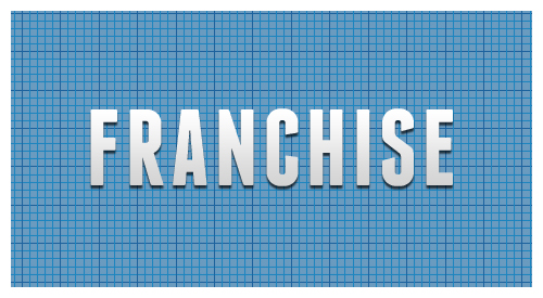
Franchise. My current favorite of favorites. This is currently being used throughout progravix.com, and it looks great. Another font with only small caps (no lower case), but that’s fine with me. It looks great big and bold. I love using this on construction material, or huge display areas that demand your attention.
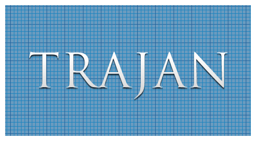
Trajan. I must really like fonts with all caps, or small caps, because here is yet another. This is a serif font, that really doesn’t have overbearing feet. This is perfect for announcements, or a very corporate look and feel. It’s an attorney’s perfect font, since any name looks great in it.
So there you have it, eight of my current favorite fonts. Out of the 1,238 fonts I have installed on my system, I think I did a good job whittling it down to eight. Makes me really think about recycling some of those unused fonts.
This has been today’s Clarified Butter.

