Spam, we hardly knew ye

You’d think that having such a dominant online presence, I would be much more susceptible to spam. The truth is, I hardly ever see it. You’re probably sitting there wondering what the heck I am talking about. Everybody gets spam, right? We’re always clogged up with viruses, avoiding overseas scams, and constantly shuffling through our junk folder to find that one good email accidently flagged as naughty.

Not me.

First off, we use Macs here, running one flavor of Mac OS X or another. We’re insane about our backup techniques, and never download anything from the internet unless it’s from a reputable source. So, let’s throw the fear of viruses right out the window.

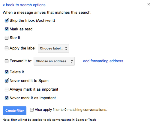
I came across this solution when I was trying to solve a problem with iOS not having a junk mail feature. I had never used the Junk Mail feature in Mac Mail, my preferred email client, and preferred to let everything accumulate in my inbox. This was fine at first, but when the spam really started to flow, I needed a solution. That solution couldn’t be based on Mac Mail’s junk mail feature, because I never wanted the spam to be downloaded in the first place. This meant that it had to be taken care of at the server level.

We use Google Apps for our email and other online needs, but for the purposes of this post, Gmail functions exactly the same way. We need to setup a filter within Gmail that stops the spam from ever getting sent to our inbox.

If you don’t have Gmail (or Google Apps) I highly suggest you get it, and forward all your mail there. It’s up 99.9% of the time, and dang easy to setup and use.

Let’s set this up.

After you’ve logged into Gmail, go to Settings and click on the Filters tab. Click ‘Create a new filter.’ In the resulting window, enter “is:spam” (without the quotes) in the ‘Has the words’ field and click on ‘Create filter with this search.”
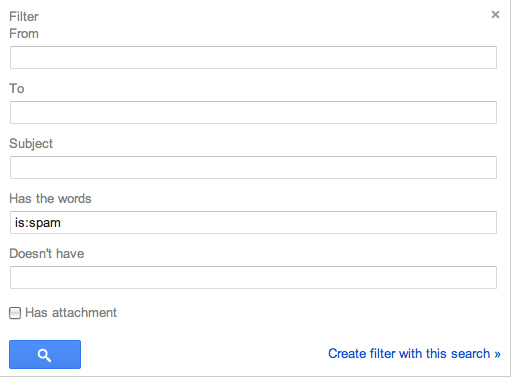
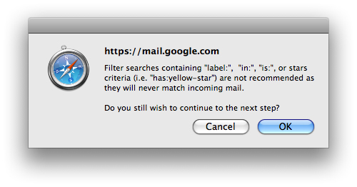
A dialog will pop up warning you that using “is:” will never match incoming mail, but I can assure you, it does. Click ‘OK’.
On the next window, check the following:

  • Skip the Inbox (Archive It)
  • Mark as read
  • Delete it
  • Never send it to Spam
  • Never mark it as important

This will put all mail that Google considers spam into the Trash folder. It will appear as already read (so you won’t have any unread flags). This is also good because Trash is automatically deleted in 30 days, so you never have to go in and manage your junk mail. It also gives you a 30 day window to find any messages inappropriately flagged as spam. I can tell you, however, that for me, not once has a legitimate message been flagged as spam by Google. All my junk goes directly to the trash and I never see it.

Now, just to get a similar setup with my local Letter Carrier. Maybe she can put it right in the recycle so I don’t have to touch it.

So, there you have it, a great solution for spam management that’s easy and effective.

This has been today’s Clarified Butter.

My current favorite fonts

I saw a blog post the other day written by a designer, and he shared a set of fonts that he’d been partial to lately. I figured I would make a similar list, but let’s call it my current favorites, because, to be quite honest, a font only lasts as long as your favorite shirt that turns into vaporwear. I have a list of eight fonts that I tend to use quiet a bit. They are shown here in their native form (with loose tracking). When I use them within projects, they are usually altered quite a bit.

Enjoy…

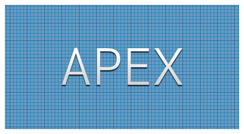
Apex. Here it’s shown as Apex Book, but it comes in flavors from Thin to Ultra. This is a great font for headers and other callout areas. I would say it’s not a good idea for body text or other areas where numbers might be used. The numbers within this font have a very mixed baseline, and are usually well below the baseline of their alphabetic companions.

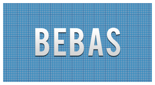
Bebas. Another great font for headers since it does not include lower case. You can fiddle with it to create a good looking small caps, but really this font looks best native, with a very loose track. Here it’s shown with a tracking of 40.

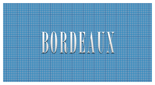
Borbeaux. Okay, so this font might not get a lot of use, but when you need something clean, crisp, and thin, this is your font. I recently used it across various spaghetti fundraiser materials, from tickets to posters and flyers.

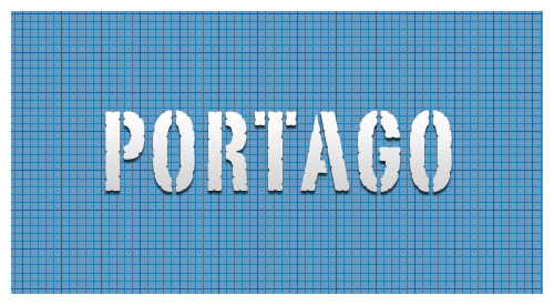
Portago. This is a great font for travel-based media. This is another font with only small caps, no lower case, so it’s use is limited to headers and callouts.

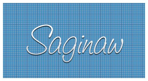
Saginaw. It’s rare to find a script font that reads well. Shown here in Medium, it’s also available in Light and Bold. Other than using it for mock-signatures, I really like it for designs that call for a wispy or light feel. It’s great for logos that need a similar feel.

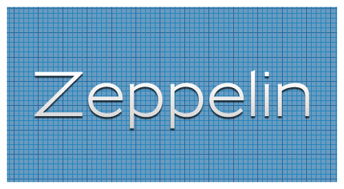
Zeppelin. This is a very versatile font. Shown here in 41, it’s available in widths and weights from 31 to 53. I love using this for small, uncluttered tables (such as specifications) where Helvetica or Arial would usually prevail.

Franchise. My current favorite of favorites. This is currently being used throughout progravix.com, and it looks great. Another font with only small caps (no lower case), but that’s fine with me. It looks great big and bold. I love using this on construction material, or huge display areas that demand your attention.

Trajan. I must really like fonts with all caps, or small caps, because here is yet another. This is a serif font, that really doesn’t have overbearing feet. This is perfect for announcements, or a very corporate look and feel. It’s an attorney’s perfect font, since any name looks great in it.

So there you have it, eight of my current favorite fonts. Out of the 1,238 fonts I have installed on my system, I think I did a good job whittling it down to eight. Makes me really think about recycling some of those unused fonts.

This has been today’s Clarified Butter.
Keep it vector, Victor

Vector graphics is the use of geometrical primitives such as points, lines, curves, and shapes or polygon(s), which are all based on mathematical expressions, to represent images in computer graphics. “Vector”, in this context, implies more than a straight line.

You know, I really love Wikipedia.

I try my best to keep illustrations vector, and with the seam-busting amount of tools in Illustrator, it’s a fairly easy task. I will agree, however, that raster images do have their place. But, when it comes to developing content that needs to be scalable, without the loss of quality, vector is where it’s at.

I probably spend 80% of my time in Illustrator, designing logos, box artwork, labels, trade show booths, and thousands of other items. If at all possible I can replicate a raster-technique using Illustrator, I do it.

Recently, I was asked to create a logo where an element of the design had an iridescent finish. Iridescent is that rainbow reflection you get from stones and other materials. Most of us probably see it when crude oil and water are mixed. When the sun’s light reflects off the surface of the oil, the light radiates a rainbow shine that moves when the oil moves (or we move).

Now, accomplishing this in vector format might seem impossible, and given that this is a static image, how could we truly portray an iridescent appearance? It’s not important that the element look exactly like a real world example, rather that it portray itself as such. Thinking outside the box, or inside Illustrator, is where we need to focus. I chose to use varying shades of the iridescent colors to create boxes of increasing size on an arch, or more clearly, in a half-circle, where the boxes become increasingly larger the further they get from the bottom center. What we are left with is not a mixed gradient of the colors, rather a unique image that presents a multi-surface appearance.

So, in the end, we are left with a purely vector image that can be scaled to several thousand feet in width, if needed, with no loss of quality.

This has been today’s Clarified Butter.