Paper or plastic?

Would you like paper or plastic? I haven’t heard that it years, although my wife swears that her grandmother asks for paper in plastic. I didn’t even know that grocery stores still offered paper. But to actually request both? Take that environment!

To be honest, I have nothing against the environment. I go paperless as often as I can. Well, except in one area.

The newspaper.

I receive the local paper, The Arizona Republic, daily. The so called “Monday to Sunday” subscription. For years I have paid roughly $10 per month to receive the paper, each morning. To their credit it has always been on-time, and for the most part damage free. A few months ago they decided to change their subscription model to an “all you can eat plan,” combining their daily print edition with full online access. In theory, this is great, but here is the problem: it costs over twice as much. Prior to this change, their website, AZCentral.com, was completely free. I never used their site. It was cluttered, jammed full of ads, and was incredibly slow. Their alternative is a $10 per month online-only plan, with all the same flaws I’ve already shared. Great you think, right? Mr. Techie here should love consuming and digesting his local news from the vast interwebs. Not so…

The reality is that I just don’t like getting my local news from an online source. I don’t know what it is, but I just like the feel of holding newsprint in my hands. I enjoy eating breakfast with the morning paper sprawled out across the table, carefully deciding what to read based on the headlines.

Every print addition makes special note to call attention to print readers enabling their online access, promising an “exact digital replica.” I’ve tried this so called replica, but it’s just not the same. Something about walking out barefoot on the cool driveway, picking up the slightly dewey paper, snapping off the rubber band, and griming up your fingers with soy ink just can’t be replicated digitally. Well, until there is an app for that.

What’s more strange is that I have changed magazine subscriptions to digital, and it feels no different to me. I subscribe to computer magazines, and I do enjoy consuming techie news and rumors online, so maybe that has something to do with it.

Overall, I don’t think it’s fair that I must now pay over twice as much to receive the same exact thing that I’ve always had. Especially seeing as how the newspaper is already 65% advertisements. I no longer subscribe to cable or satellite television service. Mostly because I can’t stand paying for 100’s of channels I don’t enjoy, but moreover, all of the advertisements that I am paying to watch. Something about that just isn’t right. Maybe I should use that same logic in my reading habits.

This has been today’s Clarified Butter.

PDF Compression: Use it wisely

Nothing aggravates me more than individuals or organization sending out (or making available) important information in a Word file. How difficult is it to create a small, widely supported, open-source PDF? Not difficult at all.

Just below that level of aggravation is another matter spawned from a similar lack of detail. File compression. You know, making files much smaller than they really need to be. We all consume compressed music, videos and photos. Why not add PDF to that list? ProGravix delivers artwork in compressed ZIP archives, and we always create media consumed by our client’s customers in a perfectly compressed format.

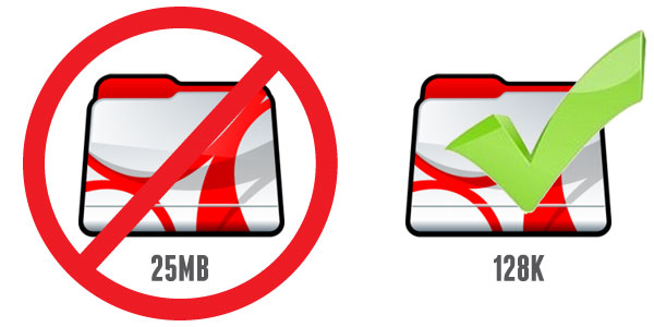
The best place to implement compression is within our PDF files. Certainly we want to create high resolution artwork (for those times that the printer prefers PDF). But when it comes to making brochures, sales sheets, manuals, et cetera available on our websites, what’s the point in posting that huge 250MB file? The chance that they are going to print it is very slim, so creating a low resolution file that’s great for online viewing is what we need.

There are several levels of PDF compression. By default, a high resolution PDF (preferred by printers) contains 300dpi images and uncompressed text and vector elements. These types of files are extremely bloated, resulting in very long load times – which is fine when you are sending art to a printer… it only needs to be uploaded and downloaded once.

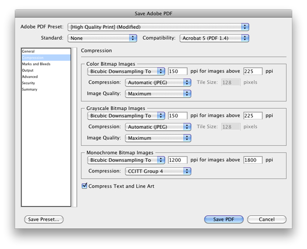
Adobe has developed several compression presets. The two I most widely use are High Quality and Smallest File Size. High Quality is great for creating artwork or high res proofs. Smallest File Size is great when you need to make files available on a website for download. The downside to the Smallest File Size preset is very low image quality. All images are reduced to 72dpi, with a very high JPG compression. I think the best option is the sweet spot between these two presets.

When creating a web-ready PDF file, where images need to be slightly better than web quality, I choose the High Quality preset, and modify the compression settings. Set Color Bitmap Images and Grayscale Bitmap Images to 150ppi. Also make sure that Compress Text and Line Art is checked. You can also choose to lower the ppi for Monochrome Bitmap Images as well (if your document contains them).

I usually keep JPG Compression to Automatic, but you can test your results, and choose a compression that suits your needs.

Overall, we need to be mindful of our visitors time. We need to allow them easy access to our information, at a reasonable speed.

This has been today’s Clarified Butter.
Understanding and creating your own barcodes

We’re all familiar with them, but do we understand what information they hold, and how to create them? Probably not. We just know that when the cashier scans them, the register beeps and we’ve spent some money.

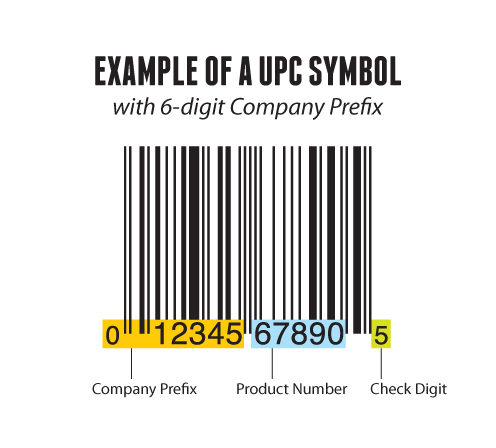
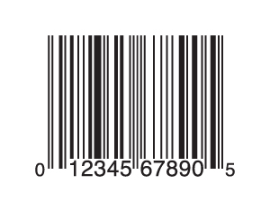
We create a lot of retail packaging, and a vital part of that packaging is having a valid UPC symbol. UPC symbols are generated from two bits of information, your company prefix, and the product number. The last number, the check digit, is automatically calculated based on the previous 11 numbers.

Above we can see an example of a UPC symbol with a 6-digit company prefix. The first six digits are assigned by GS1-US (a governing agency for the assignment of manufacturing codes). The next five digits are the product code, which is assigned by the manufacturer. And again, the last digit is a check digit based on a calculation of all of the other numbers (which I won’t go into here, since there are tools that do the math for us).

It’s important to note that you cannot simply create your own company prefix, and resulting UPC symbols, without first obtaining one from GS1-US. This is so you don’t accidentally use a number that already exists, which would really cause problems for retailers.

In a past post, I explained QR codes, which have quickly become popular. These QR codes can be generated by anybody, and do not require any assigning agency or government oversight. In addition to QR codes, there are hundreds of other barcodes that various businesses use internally to help streamline their processes. ITF-14 is a good example. I use ITF-14 as SKU numbers for pallets and multiple-unit cases. These ITF-14 numbers are also assigned by GS1, and are used to encode a Global Trade Item Number.

So, now that we know what these barcodes are, how do we create them? For years, I had been receiving physical artwork for UPC symbols from clients. Obviously this is a pain, requiring that I scan the barcode in, and if you have been reading this blog, that doesn’t provide me with a vector version I so desperately desire.

Recently, I’ve been using a neat little tool I found called the Online Barcode Generator. This no-frills generator is extremely powerful. It allows for the creation of hundreds of different types of barcodes, automatically calculating that check digit, if needed. It provides the resulting barcode in PNG, JPG, and yes, EPS format. I obviously opt for the EPS format. It quickly opens in Illustrator. The barcode lines are strokes, and numbers are actual text (Helvetica), so I quickly outline the strokes and fonts to alleviate any scaling issues.

So, there you have it. Barcodes and how to create them. Go barcode crazy!

This has been today’s Clarified Butter.
Corporate greed, or just doing business

I recently received an email informing me of my inclusion as a member of a class action lawsuit against Netflix. I usually just delete these things (or recycle as needed), but this one caught my attention. Apparently a couple of gentlemen from Virginia decided to sue Netflix for retaining their personally identifiable information for at least a year after they cancelled their accounts.

Their personally identifiable information was described as:

  • Names, phone numbers, and address
  • Billing information, including credit card numbers
  • All previously requested DVDs and instant titles
  • DVD and instant queues
  • Preferences and ratings on watched titles

I can agree that Netflix does retain ALL of this information. Having been a subscriber to their DVD service seven years ago (opening and closing an account in 2005), I opened an account in 2011 to discover that my queue still existed, along with a list of all DVDs ever mailed to me, my old credit card number including expiration dates, and all of my ratings.

Now, part of me feels this is an invasion of my privacy, and a potential security risk. On the other hand, how helpful that all of my ratings and viewing history had been retained so that I could pick up right where I left off (so to speak). However, the U.S. Government had already made the conclusion for me…

Apparently, there is some 1980’s federal law which prohibits “video tape rental providers” from retaining rental history a year after its original use. I know, you are sitting there wondering how this applies to Netflix. I thought the same thing. Netflix has never provided video tapes for rental, or sale for that matter. Nonetheless, the law was interpreted by the court that it apply to similar rental services. I can imagine the bickering back and forth with Netflix lawyers explaining the difference between circular DVD platters and rectangular VHS tapes.

So, what exactly was Netflix trying to accomplish? Were they retaining that information to help customers that potentially would come back, or to line their pockets by selling my information to third parties?

This case provides a great opportunity to examine our current laws, especially those which were written before the great advances in technology over the last two decades. Laws which govern piracy, internet technologies, fair use, copyrights, net neutrality, and much more. We need laws that are clear to understand.

Another bone of contention for me, with class action lawsuits, is the enormous amount of cash heaped upon the class action attorneys. In this Netflix case, attorneys are being rewarded $2.5 million, plus $250,000 in reimbursement (because, you know, that $2.5 million just ain’t gunna cut it). The two class action representatives will each be awarded $15,000 (you now, the guys actually ‘damaged’ by Netflix), and all of us other class action members get $0. Zip. Zilch. Nada. Apparently, any money left over gets donated to not-for-profit organizations determined by the court.

Only once have I ever opted out of a class action lawsuit (some sort of judgement against Apple which I didn’t think was fair). I really don’t think it’s worth my time to actually look into these class action suits, and opt out. Maybe I should. You never know. I might get another 7¢ check from an eBay settlement.

This has been today’s Clarified Butter.
Achieve best results from iMovie to iDVD

My main concern with iMovie ’08 several years ago was the complete removal of easily creating a DVD from within iMovie (via iDVD). Certainly this was addressed via the followup ’09 release of iMovie, but an issue still remained, and still remains today. iMovie uses single-field processing. This means that every other horizontal line of the video is thrown out, which reduces the sharpness of the footage. This quality loss is exaggerated when attempting to export to DVD, which is interlaced video.

I won’t go into the difference here between interlaced and progressive. I’ll assume that by now you’ve heard this 1000 times, with all the 480i, 720p, 1080i, 1080p jargon.

The simple fact is that the loss of that dropped second field really causes problems with DVD, which is 480i. Throw in an upscaling DVD player that exports at 1080p, and you’ll have a hot mess.

Luckily, there is a way to achieve the best results you can. Certainly the best way is to use a version of iMovie prior to iMovie ’08, such as iMovie 6 HD. Unfortunately, this really limits your editing abilities afforded by using a newer version of iMovie.

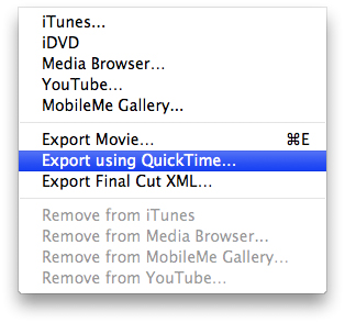
So, assuming that you’ll be using the newest version of iMovie and iDVD, the method of importing and editing your video remains the same. The quality retention (at least the best it can be), is handled when the video is complete, and being exported to iDVD. You’d think that using the Share > iDVD menu item would give you the best possible quality. This isn’t so. The trick is using Share > Export using QuickTime…
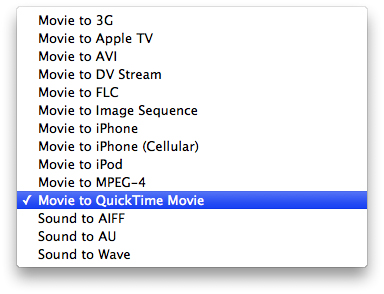
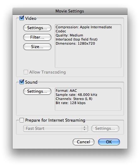
Once the dialog appears, choose Export: Movie to QuickTime Movie and click on Options…

Make sure both Video and Sound are checked. Then click on Video Settings.

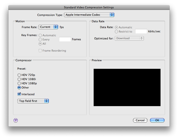
For Compressions Type, choose Apple Intermediate Codec, Frame Rate: Current, Data Rate: Automatic. Under Compressor, choose Other, check Interlaced, Top Field First. Click OK.

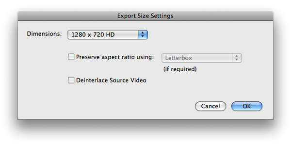
Next, click on Video Size. Choose Dimensions: 1280×720 HD. Make sure Deinterlace Source Video is unchecked. Click OK.

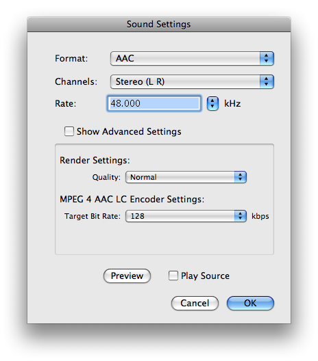
Next, click on Sound Settings. Make the settings match what is shown below. The sound settings here do not affect the quality of the video. You can adjust these as needed. Click OK.

Name your video file and click save. A special note here is that this will create a very large file: a rate of about 20GB per hour. Remembering that iDVD will need hard drive space that is double the final size of the DVD, you’ll need to make sure you have the resources.

The resulting video quality won’t be 1080p HD quality, but it certainly will look a lot better than using the Share > iDVD method. Your video and titling will appear with much less jaggedness. Certainly not super-crisp, but much better than the progressive version that iMovie would otherwise export.

Apple would like us to believe that physical media like DVDs are dead, but there still is a need for it.

While we’re covering iMovie and iDVD: I almost always provide an HD digital copy on the DVD-ROM portion of the DVD. This allows the recipient to have an ultimate quality version for their local media library, smartphone, iPad, or other digital device. I export using an MP4 container and the H.264 codec to provide maximum compatibility.

This has been today’s Clarified Butter.

Update: No subscription TV service

A little over a year ago I wrote a post detailing my one year anniversary into an experiment testing having no subscription television service. With it now being two years with no TV service, I thought I would provide an update and let you know how it’s going.

The good news is that I still do not subscribe to any television service. That means no cable, no satellite, nothing. The only exception is Netflix, which at $8 a month, I am happy to have. Some might argue that Netflix is a subscription service, but I think we can all agree that it certainly does not compete with cable or satellite (and is a tenth the cost of what I used to pay).

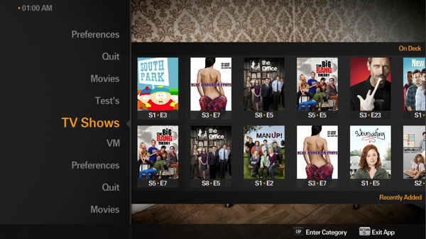
To date, I have saved $1,920 (not counting the increase in fees that Dish Network would certainly have imposed). This easily has paid for the substantial initial investment in hardware (mainly new Mac Minis and various other peripherals). We still use Plex, eyeTV, Hulu Desktop and a few other apps. We do most of our viewing in Plex, although my wife would argue that I spend a lot of time in eyeTV watching COPS episodes which have recorded overnight. I’m sorry, it’s a guilty pleasure.

Plex continues to become more and more stable. It’s install base is growing by leaps and bounds, given that it’s now available on iOS, Roku, Google TV, LG, and various other media devices. I love that I can start a show on my iPod, pause, and pickup right where I left off in the home theater. Additionally, with the fairly new myPlex service, you can easily access all of your movies and TV shows remotely with no effort at all. You just sign into myPlex, and all of your media stored at home is available.

Certainly Netflix’s catalog is lacking… their loss of Starz Play’s 1000 titles didn’t help. In our house, Netflix is great for the kids. It’s jam-packed with child-friendly programming. Now and then you might run across something suitable for adults, but for the most part my instant queue (and recommendations) makes me feel like I am in preschool. Amazon’s Instant Video service is becoming a solid competitor to Netflix, but seeing as how they provide no 10-foot user interface for Mac (you must access the titles via a browser), I’ll stay with Netflix (which plays via Apple remote in Plex).

I’m not saying this setup is for everybody, but to me, it’s been a success.

This has been today’s Clarified Butter.

Press ready art: general guidelines

Over a decade ago we used to prepare files for film producers, to create negatives from which metal plates were made for the purposes of offset printing. Long gone are the days of right-reading, emulsion-up, negative specs (at least for us). I remember dropping off a ZIP disk (remember those?) to a service bureau, having the receiver tell me that my files were always perfect. She explained that I always provided the necessary fonts, embedded images, and such. This resulting in a much faster turnaround time.
Nowadays, practically everything is digital, from design to press. This helps smooth out pre-flight issues, but there are still some general rules that you must follow in order to meet a print shop’s requirements. A lot of press houses provide templates and specific guidelines for their purposes, but in general, these will help you avoid any hiccups.

Bleeds
A bleed is the extra artwork that extends past the trim mark. In general, a 1/8″ bleed is sufficient. Some printers request 1/4″, but that is typically reserved for larger booklets or manuals.

Trim marks
Trim marks (also referred to as crop marks or registration marks) are those guides at each corner of the printed piece that show the final cut size. In full color printing, these help with registration, showing that all colors are being printed perfectly in sync.

Resolution
In general, raster artwork should be developed at 300dpi. Some large scale items such as trade show booths and banners can be developed at 150dpi, but I recommend checking with the manufacturer of those items. Artwork developed in Illustrator in usually resolution independent. However, raster items, such as drop shadows, should be set at 300dpi.

Outline text or provide fonts
To resolve any font issues that may arise, convert all text to outlines. In applications that do not support this, make sure to provide all fonts used in the piece. In general, a PDF Press Ready file will include the fonts, but some fonts have licensing restrictions, and cannot be embedded in PDF files.

CMYK
Unless otherwise directed by the printer, your artwork should be in the CMYK color space. Most full color artwork is printed on a four color offset press. Make sure your artwork is in CMYK mode from the very beginning. Transitioning from RGB halfway through a project’s development can produce unwanted color issues.

File format
The industry standard artwork format is PDF Press Ready. Again, you should check with your printer, but the PDF format is widely supported across all platforms. For the most part, what you see is what they will see, but again, it’s not foolproof. If you have a very complex file, I recommend converting it to raster, providing the file in TIFF format.

This is just a few general guidelines. Again, check with your printer. In most cases, we don’t know who the printer is until we are asked to provide artwork. In can be difficult to go back and implement some of these tips, so keep them in mind.

This has been today’s Clarified Butter.

Facebook Cover Photo Template

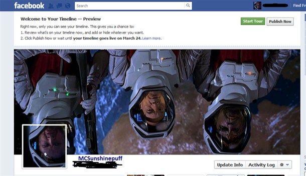
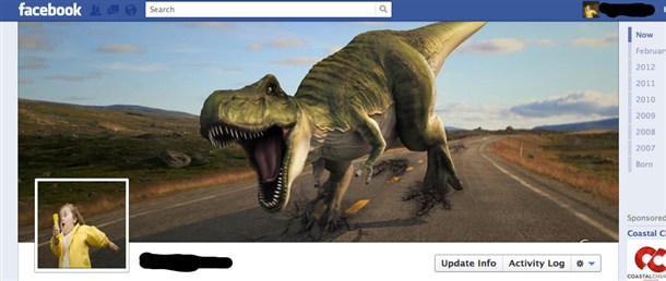
Several days ago I wrote about the new Timeline layout that Facebook is implementing across all profiles and pages. I detailed some steps, providing the dimensions of the cover photo. Since then, I’ve come across several Timeline layouts (cover/profile photo combos) that really took this to the next level. Here are a few…

As you can see, some creative souls out there are really taking advantage of this new layout.

To help this along, I’ve decided to provide a layered Photoshop template (Windows: rick-click and choose Save As…, Mac: option-click or right-click), which should help get you up and running quick. Don’t forget to come back and leave your Facebook URL in the comment box so I can take a look. I’m excited to see what you guys come up with!

This has been today’s Clarified Butter.

9 tips for creating an eNewsletter or HTML email

We create several HTML newsletters each month. All have their own unique look and feel, but do share some general rules that provide compatibility across the majority of browsers, clients, platforms, and systems.
Here we will cover some of those rules. I will note, however, that these are my general rules, and not necessarily practiced or enforced by all.

Set a defined width
Since most emails are received within an email client or web-based email service, you can’t be guaranteed of the space available for your content. You could obviously set a width of 100%, and let your content scale with the user’s display area, but in reality this can wreak havoc on any design you are trying to retain. In general, you want to keep your layout within 550-650 pixels. I use a fixed width of 600 pixels. This allows me to create content that is exactly 600 pixels wide, and will look exactly the same regardless of who is viewing it.

Use inline styles
When developing a website, every developer would cringe at the thought of using inline styles, but in the email world, they are your best friend. On a website, you’d create classes and share them among all of the pages on your site from a central file. Unfortunately, in an email, clients strip or won’t render those classes. So, make sure to define all fonts, sizes, coloring, et cetera using inline styles.

Use tables
Again, another no-no in the website world, becomes very helpful with HTML emails. Email clients are dated applications. They don’t render global CSS very well, and don’t keep up on standards. It’s best to organize your content using tables, as opposed to DIVs or other structuring methods.

Forget about background images
This might seem like a good idea at first, but again, most email clients won’t render them, and you will be left with an email that is either a horrible design, or simply not readable.

Don’t set specific dimensions for your images
Most web-based email clients will not display inline images by default, and instead ask the user’s permission before displaying them. The best course here is to not define the image’s height and width. This will reduce the amount of white space that is seen before the user hopefully allows those images to load.

Use ALT tags
ALT tags are assigned to images and other elements. When the user has images turned off be default, and you have properly defined ALT tags, those tags will be used in place on those images until they load. Make sure to use ALT tags that describe or match the image.

Don’t use Javascript
Plain and simple, don’t even try. It won’t work, and will only increase the chances that your email gets flagged as spam.

Include a plain text option
I personally prefer to receive all email as plain text. If I want to view the HTML version, I turn it on. Plain text lets me get to the content quicker. It’s easy to include both versions as one, single email, and the recipient’s client displays the version based on their local settings.

Keep it simple
That means content-and-design-wise. Keep huge blocks of text to a minimum. If you need to share more of a story, include a read more option, and link it to your site. In general, it’s easy to keep your design simple – the outdated email clients are enforcing that. Keep the use of images to a minimum, and make sure they are optimized to speed download time. Make sure to host your images on a server that is fast, and always available.

There you have it, 9 tips for creating an HTML email. Again, not standards-based rules, just ones I prefer to enforce locally.

This has been today’s Clarified Butter.

Add a Facebook Like button to WordPress blog posts

Adding a Facebook Like button to your non-Facebook content can greatly increase its ability to be more social, and be shared with a greater audience.

Here we will discuss adding a Like button to your WordPress posts. That is, a Like button for each individual post, and not for the entire blog (which is also a good idea to have in your sidebar). A Like button allows Facebook users to like specific posts on your blog, which in turn displays this as a story on their profile (and potentially on their friend’s feeds or tickers).

For the purpose of this post, we will be using the Twenty Eleven WordPress theme. This plugin will work across many other themes, but using this theme, and similar themes, will allow us to better place where the Like button appears.

The first step is generating the Like button code to be added to our theme’s template files. Like button code can usually be created with the tool provided by WordPress. The problem is that the URL to define is dynamic, and we can’t specify a static URL. Luckily, each individual WordPress post has a defined Permalink, and we just need to make a request for that URL.

Here is the code you need to use. I’ve already embedded the Permalink code. Copy this to your clipboard:

<iframe src="http://www.facebook.com/plugins/like.php?href=<?php echo urlencode(get_permalink($post->ID)); ?>&amp;send=false&amp;layout=button_count&amp;width=150&amp;show_faces=false&amp;action=like&amp;colorscheme=light&amp;font=trebuchet+ms&amp;height=21" scrolling="no" frameborder="0" style="border:none; overflow:hidden; width:150px; height:21px;" allowTransparency="true"></iframe>

Now, in WordPress, login to Admin and go to Appearance > Editor. Under Templates click on the content.php file. This is the file used to display the posts on the main index page of your blog.

Paste the code just after the </h1> tag, which is the title of the post. Click Update File to save your changes. Now visit your blog’s main page to see the Like button in action.

Next, open the content-single.php file and paste the same code before the <h1> tag. This template file displays a single post’s content. I prefer the look of the Like button above the post title on single-post pages, but you can add it anywhere you prefer. Click Update File to save your changes.

Now, on your blog’s home page, click on a post’s title to see the full post in the single-post layout. You will see the Like button above the post’s title (or wherever you placed it).

There you have it, a simple implementation of the Facebook Like button on your WordPress blog. Now, write some really neat-o blog posts worth liking, and put Facebook to work for you.

This has been today’s Clarified Butter.